
css3:animation實現時間軸動畫
阿新 • • 發佈:2019-02-17
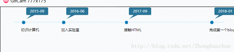
1.效果預覽
2.實現步驟 建立時間軸的整個div結構 定義時間軸上的事件
定義偽類元素(時間軸上的時間節點)
2.實現步驟 建立時間軸的整個div結構
新增基礎樣式(可選)<div class="memorial_day"> 外層盒子 <div class="time_axis"></div> 動畫時間軸 <ul> <li class="n1"> 節點資訊 <a href="#">初識計算機</a> <div class="dataview">2015-09</div> </li> <li class="n2"> <a href="#">加入實驗室</a> <div class="dataview">2016-06</div> </li> <li class="n3"> <a href="#">接觸HTML</a> <div class="dataview">2017-09</div> </li> <li class="n4"> <a href="#">完成第一個blog</a> <div class="dataview">2018-01</div> </li> </ul> </div>
* {margin: 0;padding: 0;}
body {font: 14px "微軟雅黑", Arial, Helvetica, sans-serif;}
ul, li { list-style: none; }
a:link, a:visited, a:active { text-decoration: none;}
a:hover {text-decoration: none;}
定義時間軸樣式+動畫.memorial_day { width:840px; overflow: hidden; position: relative; /*因為有個子元素要用absolute*/ padding:60px; }
定義對話方塊裡時間的樣式.time_axis { background: #e9f5fb; height: 6px; width: 100%; -webkit-animation: time_a 5s; /*定義動畫名字以及播放時間*/ -moz-animation: time_a 5s; -o-animation: time_a 5s; animation: time_a 5s; } /*因為只寫了四個事件,所以我這裡分成了四個事件段*/ @keyframes time_a { 0% { width:0px; } 25% { width:250px; } 50% { width:500px; } 100% { width:840px; } /*總長度和外盒子一樣長*/ } @-webkit-keyframes time_a { 0% { width:0px; } 25% { width:250px; } 50% { width:500px; } 100% { width:840px; } } @-moz-keyframes time_a { 0% { width:0px; } 25% { width:250px; } 50% { width:500px; } 100% { width:840px; } } @-o-keyframes time_a { 0% { width:0px; } 25% { width:250px; } 50% { width:500px; } 100% { width:840px; } }
.dataview {
            position:absolute;
            top:-50px;     /*位置不好掌握的話,可以完成後面的再來調整,總之在時間軸之上*/
            left:20px;
            background:url(images/dtime.png) no-repeat;/*圖片資源就在下面*/
            color:#fff;
            height:46px;
            width:88px;
            line-height:30px;
            text-align: center;
}
.memorial_day ul li a {
            margin-top:30px;
            display:block;
            color:#000;
 }
定義偽類元素(時間軸上的時間節點)
.memorial_day ul li::before {
            content: "";
            width: 14px;
            height: 14px;
            border-radius: 50%;
            position: absolute;      /*這裡一定要絕對定位,讓節點圓圈釘在li的左上角*/
            background: #0979b1;
            border: 3px solid #e9f6fb;
}
.memorial_day ul li:hover::before {
            background: #075498;
            border: 3px solid #e9f6fb;
}
.memorial_day ul li.n1 {
            position: absolute;
            top: 54px;
            left: 90px;
        }
        .memorial_day ul li.n2 {
            position:absolute;
            top:54px;
            left:250px;
        }
        .memorial_day ul li.n3 {
            position:absolute;
            top:54px;
            left:500px;                /*建議中間的事件的位置和上面定義動畫的不同位置重合,感覺更好看*/
        }
        .memorial_day ul li.n4 {
            position:absolute;
            top:54px;
            left:840px;
        }