
科學計算:Python 分析資料找問題,並圖形化
阿新 • • 發佈:2020-06-16
對於記錄的資料,如何用 Python 進行分析、或圖形化呢?
本文將介紹 numpy, matplotlib, pandas, scipy 幾個包,進行資料分析、與圖形化。
## 準備環境
Python 環境建議用 Anaconda 發行版,下載地址:
* 官方: https://www.anaconda.com/products/individual#Downloads
* 清華源: https://mirrors.tuna.tsinghua.edu.cn/anaconda/archive/
Anaconda 是一個用於科學計算的 Python 發行版,已經包含了眾多流行的科學計算、資料分析的 Python 包。
可以 `conda list` 列出已有的包,會發現本文要介紹的幾個包都有了:
```bash
$ conda list | grep numpy
numpy 1.17.2 py37h99e6662_0
$ conda list | grep "matplot\|seaborn\|plotly"
matplotlib 3.1.1 py37h54f8f79_0
seaborn 0.9.0 py37_0
$ conda list | grep "pandas\|scipy"
pandas 0.25.1 py37h0a44026_0
scipy 1.3.1 py37h1410ff5_0
```
如果已有 Python 環境,那麼 pip 安裝一下它們:
```bash
pip install numpy matplotlib pandas scipy
# pypi 映象: https://mirrors.tuna.tsinghua.edu.cn/help/pypi/
```
本文環境為: Python 3.7.4 (Anaconda3-2019.10)
## 準備資料
本文假設了如下格式的資料 `data0.txt` :
```txt
id, data, timestamp
0, 55, 1592207702.688805
1, 41, 1592207702.783134
2, 57, 1592207702.883619
3, 59, 1592207702.980597
4, 58, 1592207703.08313
5, 41, 1592207703.183011
6, 52, 1592207703.281802
...
```
CSV 格式:逗號分隔,讀寫簡單, Excel 可開啟。
之後,我們會一起達成如下幾個目標:
* CSV 資料, numpy 讀取與計算
* data 列資料, matplotlib 圖形化
* data 列資料, scipy 插值,形成曲線
* timestamp 列資料, pandas 分析前後差值、每秒個數
## numpy 讀取資料
numpy 可用 `loadtxt` 直接讀取 CSV 資料,
```py
import numpy as np
# id, (data), timestamp
datas = np.loadtxt(p, dtype=np.int32, delimiter=",", skiprows=1, usecols=(1))
```
* `dtype=np.int32`: 資料型別 `np.int32`
* `delimiter=","`: 分隔符 ","
* `skiprows=1`: 跳過第 1 行
* `usecols=(1)`: 讀取第 1 列
如果讀取多列,
```py
# id, (data, timestamp)
dtype = {'names': ('data', 'timestamp'), 'formats': ('i4', 'f8')}
datas = np.loadtxt(path, dtype=dtype, delimiter=",", skiprows=1, usecols=(1, 2))
```
`dtype` 說明可見: https://numpy.org/devdocs/reference/arrays.dtypes.html
## numpy 分析資料
numpy 計算均值、樣本標準差:
```py
# average
data_avg = np.mean(datas)
# data_avg = np.average(datas)
# standard deviation
# data_std = np.std(datas)
# sample standard deviation
data_std = np.std(datas, ddof=1)
print(" avg: {:.2f}, std: {:.2f}, sum: {}".format(
data_avg, data_std, np.sum(datas)))
```
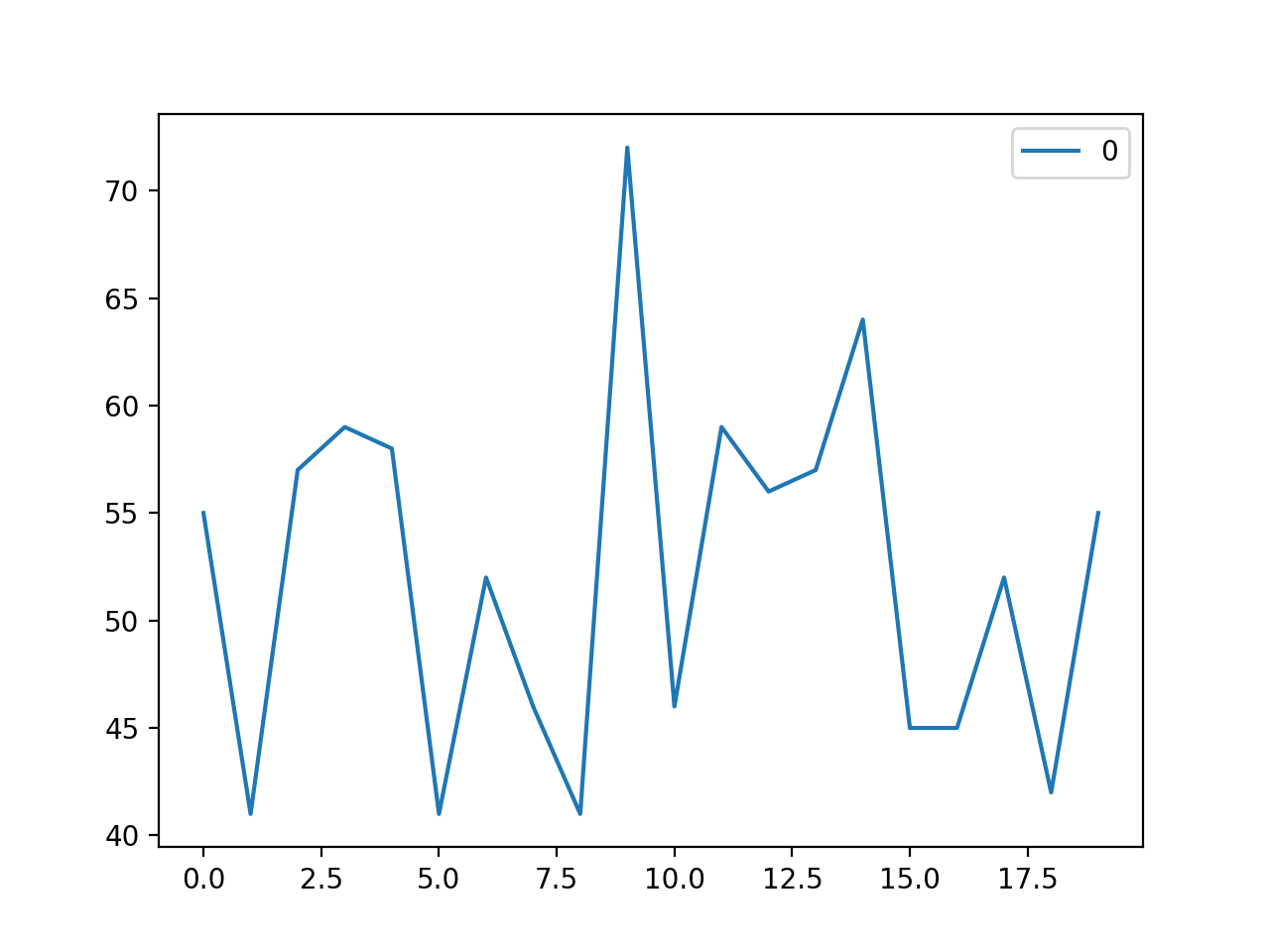
## matplotlib 圖形化
只需四行,就能圖形化顯示了:
```py
import sys
import matplotlib.pyplot as plt
import numpy as np
def _plot(path):
print("Load: {}".format(path))
# id, (data), timestamp
datas = np.loadtxt(path, dtype=np.int32, delimiter=",", skiprows=1, usecols=(1))
fig, ax = plt.subplots()
ax.plot(range(len(datas)), datas, label=str(i))
ax.legend()
plt.show()
if __name__ == "__main__":
if len(sys.argv) < 2:
sys.exit("python data_plot.py *.txt")
_plot(sys.argv[1])
```
`ax.plot(x, y, ...)` 橫座標 `x` 取的資料下標 `range(len(datas))` 。
完整程式碼見文末 Gist 地址的 `data_plot.py` 。執行效果如下:
```bash
$ python data_plot.py data0.txt
Args
nonzero: False
Load: data0.txt
size: 20
avg: 52.15, std: 8.57, sum: 1043
```
可以讀取多個檔案,一起顯示:
```bash
$ python data_plot.py data*.txt
Args
nonzero: False
Load: data0.txt
size: 20
avg: 52.15, std: 8.57, sum: 1043
Load: data1.txt
size: 20
avg: 53.35, std: 6.78, sum: 1067
```

## scipy 對資料插值
`x`, `y` 兩組資料,用 scipy 進行插值,平滑成曲線:
```py
from scipy import interpolate
xnew = np.arange(xvalues[0], xvalues[-1], 0.01)
ynew = interpolate.interp1d(xvalues, yvalues, kind='cubic')
```
完整程式碼見文末 Gist 地址的 `data_interp.py` 。執行效果如下:
```py
python data_interp.py data0.txt
```
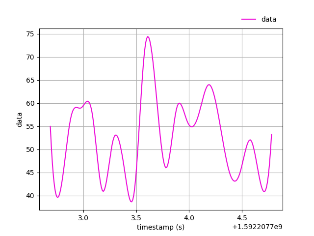
`matplotlib` 影象化時如何配置、延遲、儲存,可見程式碼與註釋。
## pandas 分析資料
這兒需要讀取 timestamp 列資料,
```py
# id, data, (timestamp)
stamps = np.loadtxt(path, dtype=np.float64, delimiter=",", skiprows=1, usecols=(2))
```
numpy 計算前後差值,
```py
stamps_diff = np.diff(stamps)
```
pandas 統計每秒個數,
```py
stamps_int = np.array(stamps, dtype='int')
stamps_int = stamps_int - stamps_int[0]
import pandas as pd
stamps_s = pd.Series(data=stamps_int)
stamps_s = stamps_s.value_counts(sort=False)
```
辦法:把時間戳直接變整秒數,再 pandas 統計相同值。
完整程式碼見文末 Gist 地址的 `stamp_diff.py` 。執行效果如下:
```py
python stamp_diff.py data0.txt
```
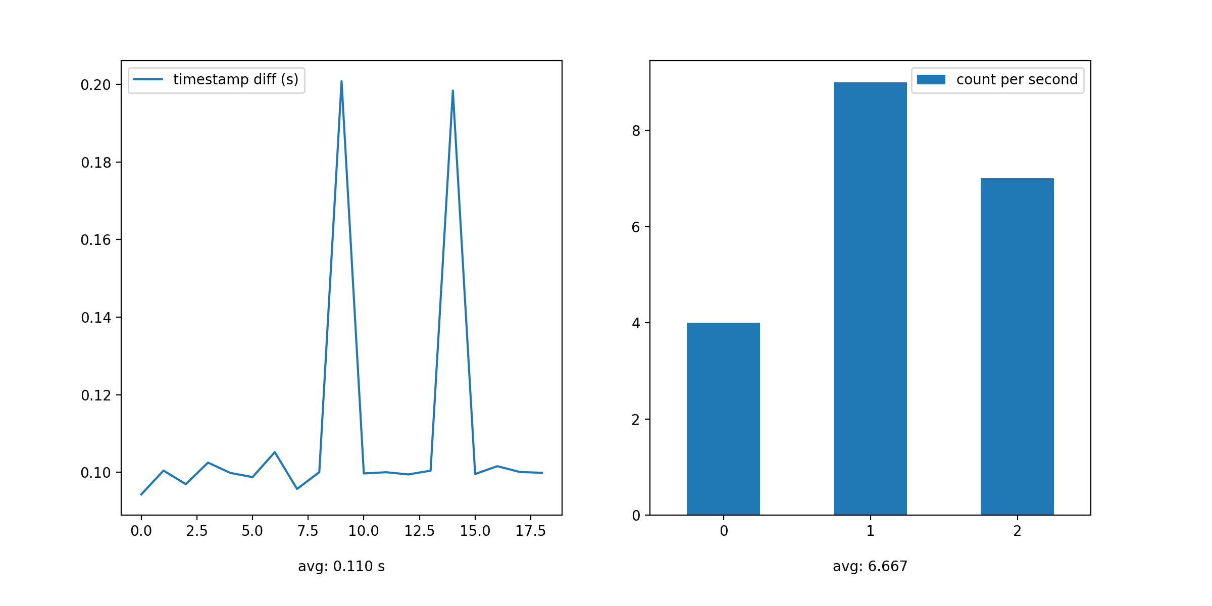
`matplotlib` 圖形化時怎麼顯示多個圖表,也可見程式碼。
## 結語
本文程式碼 Gist 地址: https://gist.github.com/ikuokuo/8629cc28079199c65e0eedb0d02a9e74