K-近鄰演算法的一個簡單例子
阿新 • • 發佈:2019-01-10
k近鄰演算法思想很簡單,一個類的資料之間距離較近,單純比較距離就好,下面註釋比較清楚,常犯的錯誤也已經標記出來了
import numpy as np
import operator
from matplotlib import pyplot as plt
def classify0(inX,dataSet,labels,k):
dataSetSize=dataSet.shape[0]
diffMat=np.tile(inX,(dataSetSize,1))-dataSet #計算輸入資料點與訓練集資料點的差值
sqDiffMat=diffMat**2
sqDistances=sqDiffMat.sum(axis=1) #計算與各個訓練集資料點的距離
distance=sqDistances**0.5
sortedDistIndicies=np.argsort(distance) #返回distance按照從小到大排序的序列的索引
classCount={} #建立一個空的字典
for i in range(k):
voteIlabel=labels[sortedDistIndicies[0]]
classCount[voteIlabel]=classCount.get(voteIlabel,0)+1 #classCount字典儲存每個標籤的數量,Get函式(key,default)若key不存在則以default為預設值建立該key
sortedClassCount=sorted(classCount.items(),key=operator.itemgetter(1),reverse=True)
return sortedClassCount[0][0]
# DBset=np.matrix([[1,1]
# [1,1.1]
# [2,2]
# [2,2.1]])
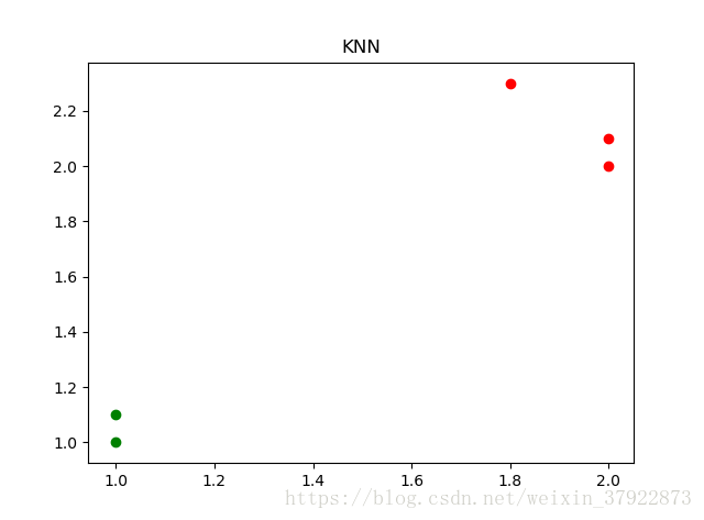
DBset=np.array([[1,1],[1,1.1],[2,2],[2,2.1]])
LB=('甲','甲','乙','乙') #訓練集的Rt(標記),注意數量要和訓練集大小一致
x=(1.8,2.3) #元組型別
kp=1
mp=classify0(x,DBset,LB,kp)
print(mp)
###############################繪圖################################
plt.figure(1)
plt.xlabel('x') #設定x軸標籤
plt.ylabel('y')
plt.xlim([0,5]) #設定x軸顯示範圍
plt.ylim([0,5])
ax=plt.subplot('111')
ax.set_title('KNN')
plt.scatter(DBset[:2,0],DBset[:2,1],c='g') #'甲'類 DBset[:3,0]需要說一下啊 (:]左開右閉(劃重點)
plt.scatter(DBset[2:,0],DBset[2:,1],c='r')
plt.scatter(x[0],x[1],c='r') #這裡不能用[:,1]這種形式,因為是一維的,沒有切片的概念
plt.show()輸出結果:
乙