
Android RadioButton設定選中時文字和背景顏色同時改變
阿新 • • 發佈:2018-12-31
在使用 RadioButton 時,有時我們會想要達到選中時文字顏色和背景顏色同時改變的效果,這裡還需要多進行幾步操作。
首先,在佈局檔案中新建一組 RadioButton :
這裡面有三個屬性要做一下說明:<RadioGroup android:layout_width="match_parent" android:layout_height="wrap_content" android:gravity="center" android:orientation="horizontal"> <RadioButton android:id="@+id/btn1" android:layout_width="0dp" android:layout_height="35dp" android:layout_weight="1" android:background="@drawable/radiobutton_background" android:button="@null" android:gravity="center" android:text="P0501" android:textColor="@color/radiobutton_textcolor" android:textSize="14sp" /> <RadioButton android:id="@+id/btn2" android:layout_width="0dp" android:layout_height="35dp" android:layout_marginStart="10dp" android:layout_weight="1" android:background="@drawable/radiobutton_background" android:button="@null" android:gravity="center" android:text="P0502" android:textColor="@color/radiobutton_textcolor" android:textSize="14sp" /> <RadioButton android:id="@+id/btn3" android:layout_width="0dp" android:layout_height="35dp" android:layout_marginStart="10dp" android:layout_weight="1" android:background="@drawable/radiobutton_background" android:button="@null" android:gravity="center" android:text="P0503" android:textColor="@color/radiobutton_textcolor" android:textSize="14sp" /> </RadioGroup>
1、android:button="@null" 這樣設定可以不顯示我們通常所見的 RadioButton 中的圓形選中按鈕.
2、android:background="@drawable/radiobutton_background" 這裡設定了背景選擇器,程式碼如下:
這裡面的選中樣式又指向一個 Drawable 資原始檔 radiobutton_background_checked.xml ,具體程式碼如下:<selector xmlns:android="http://schemas.android.com/apk/res/android"> <item android:drawable="@drawable/radiobutton_background_unchecked" android:state_checked="false" /> <item android:drawable="@drawable/radiobutton_background_checked" android:state_checked="true" /> </selector>
<shape xmlns:android="http://schemas.android.com/apk/res/android"
    android:shape="rectangle">
    <!-- 填充 -->
    <solid android:color="@color/color14" />
    <!-- 圓角 -->
    <corners android:radius="5dp" />
</shape>
以上這些資原始檔都放在 res/drawable/ 目錄下。
3、android:textColor="@color/radiobutton_textcolor" 這裡設定了字型顏色選擇器,需要稍作說明的是:需要在 res 目錄下新建一個
資料夾取名為 color ,將字型顏色選擇器 radiobutton_textcolor.xml 檔案存放在 res/color/ 目錄下面。程式碼如下:
<selector xmlns:android="http://schemas.android.com/apk/res/android">
    <item android:color="@color/color2"
        android:state_checked="false" />
    <item android:color="@color/color1"
        android:state_checked="true" />
</selector>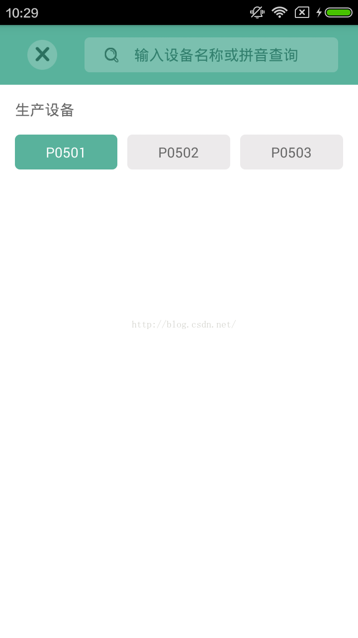

最後提一下怎麼通過 RadioGroup 獲取 RadioButton :
        RadioGroup radioGroup = (RadioGroup) findViewById(R.id.radioGroup);
        radioGroup.setOnCheckedChangeListener(new RadioGroup.OnCheckedChangeListener() {
            @Override
            public void onCheckedChanged(RadioGroup group, int checkedId) {
                RadioButton radioButton = (RadioButton) group.findViewById(checkedId);
                String result = radioButton.getText().toString();
            }
        });