
CSS3-tooltip提示框 動畫提示框
阿新 • • 發佈:2018-12-29
程式碼複製到本地可以直接看到效果
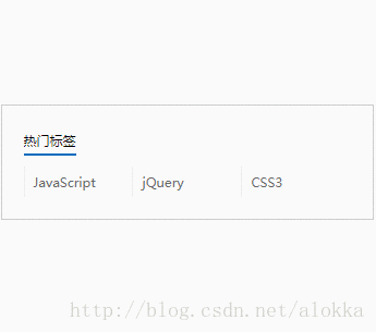
效果在這:
<!DOCTYPE html>
<html>
<head lang="en">
<meta charset="UTF-8">
<title></title>
</head>
<style>
/*清除預設樣式*/
html, body, h1, h2, h3, h4, h5, h6, form, fieldset,div,dl,dt,dd,ul,ol,li,input,button,textarea,p,th 有什麼不足,歡迎大神們指正哈