
Analysis of Subway and Foot Traffic in NYC
Analysis of Subway and Foot Traffic in NYC

We hit the ground running in our first week at the Metis Data Science Bootcamp! We had a pretty tight timeframe for our first project! It was assigned on Monday, and due on Friday.
Problem Statement
We were given a scenario in which a fictitious non-profit company WomenTechWomenYes (WTWY) had asked us to perform some exploratory data analysis to explore MTA turnstile data in NYC.
WTWY wants to send out volunteer teams out to subway stations to promote their summer gala to increase their brand awareness, participation, and potentially increase donations.They are also interested in collecting email addresses.The main aim of this analysis was to provide recommendations on where to send WTWY’s volunteer teams.
Our Approach
Our strategy to provide valuable recommendations involved finding the top subway stations with respect to foot traffic,location of tech hubs, and then verifying that the population in the surrounding areas held demographics that WTWY’s volunteers could target.Our approach was as follows;
- We analyzed MTA turnstile data for NYC to calculate the number of people passing through a subway station in the 3-month period preceding the summer gala.
- Analyzed data on local technology companies and universities as a proxy for greater percentages of women and tech-involved individuals who may be especially receptive to the WTWY outreach efforts.
- Analyzed data about WalkScore.com to identify which stations may have larger populations of non-subway riders walking past the subway entrances.
- Analyzed demographic information from the U.S. Census on local residences with greater affluence, as a proxy for a larger impact to the WTWY fundraising and outreach efforts.
- Calculated a final “ Benson Score” ( the name of our project was Project Benson!), summing the four normalized scores for the turnstile, technology, walking, and census data.
Analysis of MTA Turnstile Data
The dataset we used for station traffic involved records for the months March 2018 to May 2018, and can be found here MTA Data. This source also provides a useful overview of the data and the data dictionary.
This data-set contained the following:
- C/A, Unit and SCP: Unique identifiers for turnstiles Station.
- Linename and Divison: Information for each station.
- Date, Time, Desc: temporal data and notes for each sample
- Entries and Exits: Number of pedestrians entering and exiting subway stations.
Data Cleaning
We encountered the following issues:
- The samples were on an individual turnstile level, rather than for individual stations
- The samples were cumulative across time.
- Some turnstiles would reset randomly, subtract values and sometimes send the same record twice.
We addressed the issues as follows
- Aggregating individual turnstile traffic for each station.
- Distributing total traffic across days of the week for each station.
- Filtering outliers ( discarding negative values and values above a certain count).
MTA Turnstile Data Findings
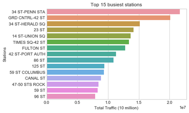
After making our data relatively clean, we analyzed the top stations by traffic.We calculated an absolute total for subway users by adding the number of entrances and exits for each station together.
The top 15 stations according to our analysis are shown below:

Once we had data on our top busiest stations, we decided to look at the traffic distribution over days of weeks at each of the top 3 stations. They had very similar distributions:

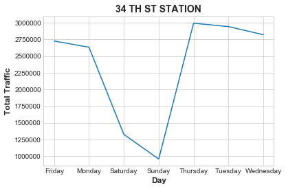

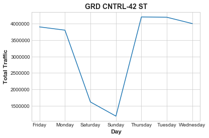

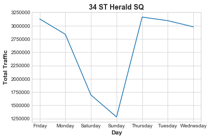
There is a spike in the number of subway users for each of the top 3 stations on Tuesdays and Thursdays.We observed this trend for all of the stations in the subway system. This either points to an actual spike in traffic, some further data cleaning that we should do.
Since we were working on a very tight timeframe, we decided to use our data as it is.
Analysis of Technology Centers near Subway Stations
The objective of this analysis presented was to complement the MTA turnstile data -with an indication of how close each station is to technology centers. The rationale is that stations near such tech hubs would have a greater proportion of commuters using those stations, and that such people would more positively respond to the WTWY volunteers at the station entrances.
Our approach was to find the location of key companies in the technology sector, as well as select universities offering technical degrees, and then to derive a normalized “proximity” score for each station based on how close surrounding tech sites are to that station.

Findings
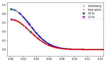
Bloomberg (9000 employees) is a larger company, so its weighted distance profile is higher in amplitude than the one for Blue Apron (890 employees). Bloomberg’s closest subway station is at 59th St (green star along blue trace), which checks out on Google Maps as only being 1 block away. On the other hand, Blue Apron’s closest station is 23rd St (magenta star on red trace), which Google Maps shows as being on the same block. As expected, the distances from Blue Apron to the 59th St station and from Bloomberg to the 23rd St station are further, as these sites are on the order of .03 degrees (2 miles) apart.
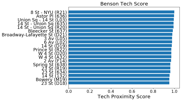
We then calculated the ‘Benson Tech Score’ for the top 20 stations based on their proximity to subway stations.

Analysis of Demographic Data
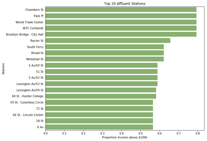
Analysis of U.S. Census data, was chosen as another way to complement the MTA turnstile data. The rationale is that pedestrians in wealthier areas may be more engaged with the WTWY and thus be more likely to make financial contributions.
The primary source for the New York City income data was Census.gov using the American Factfinder resource.
We plotted the top 20 stations based on the the “affluence” of its residents.

Analysis of Walk score Data
We analyzed data from walkscore.com to identify which stations may have larger populations of non-subway riders walking past the subway entrances.That way WTWY volunteers could target pedestrians other than subway users.
Final Results

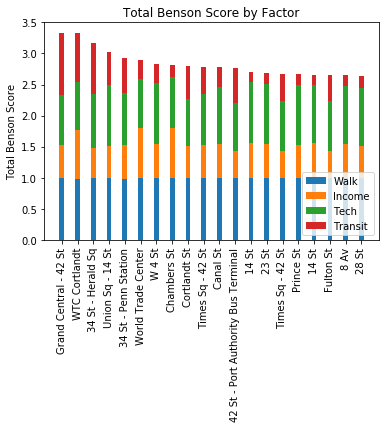
We calculated a final “Final Score”, summing the four normalized scores for the turnstile, technology, walking, and census data.
In summary, we recommended these top-five subway stations for placing WTWY volunteers:
- Grand Central at 42nd St.
- World Trade Center at Cortlandt St.
- 34th St at Herald Sq.
- Union Square and 14th St,
- Penn Station at 34th St.
Future Recommendations
This project was done on a pretty tight timeframe, and there was a lot more that we could have done!
A few things that would be next steps in this analysis are:
- Dig a bit deeper in terms of outliers investigate the spike in number of subway users on Tuesday and Thursday,
- Try different filter values.
- Analyze traffic distribution by time of day.
- Incorporate a better weighting scheme to different factors ( location of tech centers, universities, demographic data) to calculate the final score card for each station.