
Towards Data Science
There are other rigorous methods for estimating K for K-means, such as the Gap Statistic that has an impeccable theoretical foundation. But for what this article is concerned, we will now turn to other less formal approaches.
The Asanka Perera Method
This is a very interesting method that determines the ideal value for K

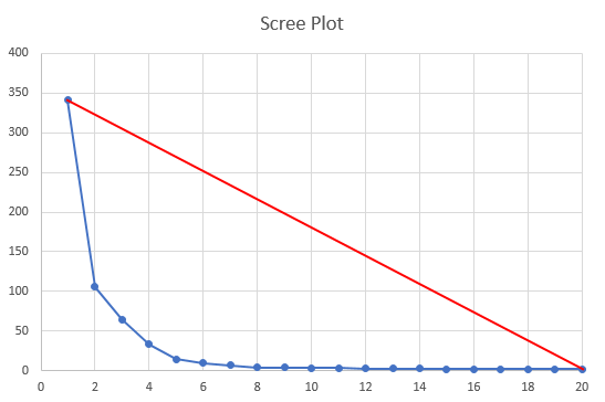
Now, you just need to calculate the distance between any one of the blue points and the red line, and take the largest one. Fortunately, it is very easy to calculate the distance between a point and a line segment. The mathematical formula just requires the endpoints of the line segment (x1, y1) and (x2, y2), and the point itself (x0, y0):

The envelope line segment is defined by its two endpoints:


We can then create a function to evaluate each of the N points like this:

The value of K that corresponds to the largest distance is your optimal K:

As you can see from the pictures above, the solution seems to be quite intuitive, but suffers from a geometric design flaw. The geometry of the red envelope line depends on N, the maximum value of K we calculate the distortions for. The plot above seems to indicate that the ideal value for K is 5, but would that be the same result if the chart stopped at K=8? Maybe not. The algorithm can be made a bit more robust to the choice of N, and in my implementation of this algorithm, I added a stopping criterion for K. This stopping criterion is related to the slope of the blue curve, so that once it is small enough, we stop increasing K and “draw” the envelope line. The criterion is quite simple, stop increasing K when the following is true:

Unfortunately, we now have a new hyper parameter to worry about, although values of 0.001 or 0.0001 for epsilon should be good enough for most purposes.
You can find the code for this estimator in the AsankaPerera.py file, in the KEstimator class. The point to line segment distance function is almost a one-liner:
@staticmethoddef distance_to_line(x0, y0, x1, y1, x2, y2): """ Calculates the distance from (x0,y0) to the line defined by (x1,y1) and (x2,y2) """ dx = x2 - x1 dy = y2 - y1 return abs(dy * x0 - dx * y0 + x2 * y1 - y2 * x1) / \ math.sqrt(dx * dx + dy * dy)
Although a bit long, the fit function is quite simple to understand:
def fit_s_k(self, s_k, tolerance=1e-3): """Fits the value of K using the s_k series""" max_distance = float('-inf') s_k_list = list() sk0 = 0 for k in s_k: sk1 = s_k[k] s_k_list.append(sk1) if k > 2 and abs(sk0 - sk1) < tolerance: break sk0 = sk1 s_k = np.array(s_k_list) x0 = 1 y0 = s_k[0] x1 = len(s_k) y1 = 0 for k in range(1, len(s_k)): dist = self.distance_to_line(k, s_k[k-1], x0, y0, x1, y1) if dist > max_distance: max_distance = dist self.K = kThe calling convention is pretty much the same as in the previous method. An example is given below in the Benchmarks section.
The RIDDLE Method
While looking at all the approaches to handle the scree plot, and its elusive elbow, I could not help but to give a good amount of thought to the different kinds of plots that came my way. They all looked quite similar, didn’t they? Actually, they all looked quite similar to the plot of one very important function in mathematics: the reciprocal function (its positive part, actually).
My first idea was obviously to try and calculate the reciprocal of the scree plot and see if there were any insights to be gained from it. Let’s look at the example scree plot we have been using and calculate its reciprocal:

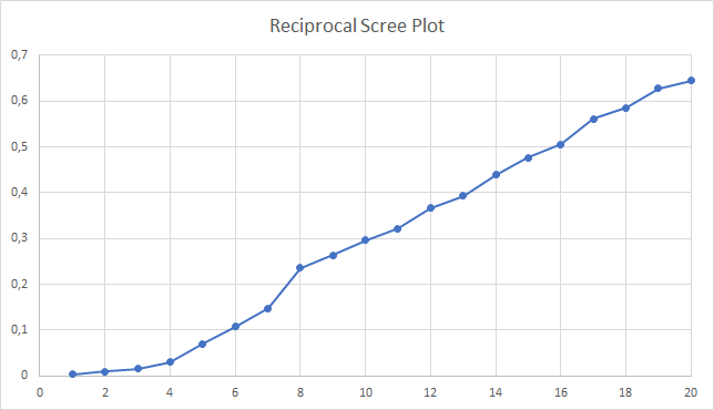
Besides looking almost like a straight line, there is a very noticeable bump before K=8. In the scree plot, this is where the line becomes almost horizontal. Maybe there is something here, so let us calculate the forward differences to see if something comes up:

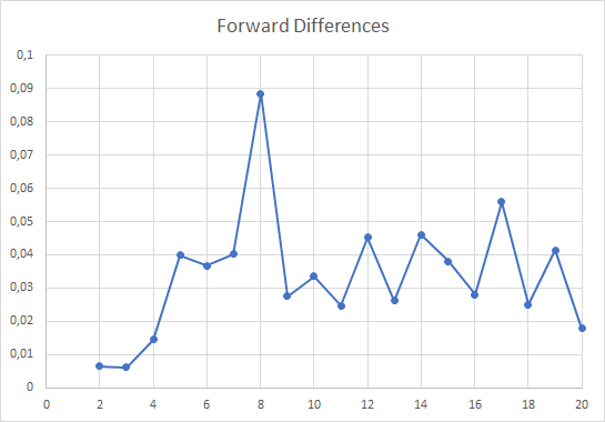
After some experimentation with different test data sets I decided, out of a total whim (or intuition), to further divide the forward differences by log(K), thereby flattening the occasional peaks that might occur for larger values of K. The resulting chart is similar to the one above, but with a distortion that makes the peak at K=8 stand out a bit more, while the others taper off. This proved decisive with some rogue data sets, where noise would creep into the larger values of K and would produce bogus peaks, taller than the one corresponding to the real value of K.
Obviously, the value to be selected is K=8 which corresponds to the original data set specs. To make this method a bit more mathematical, you could say that the decision function is:

It’s now obvious that RIDDLE cannot predict situations where K=1. Something for me to work out.
Now I can explain the name “RIDDLE”. My first attempt at naming this thing was a pompous “Reciprocal Delta Log” which conveys the basic mechanism. Then I compacted it to RDL and that’s when the RIDDLE popped out of the woodwork. Not only did the acronym suggest it, my befuddlement at how this simple mechanism worked so well over a large number of cases made me stick to the name.
The code for this method is in the Riddle.py file, in the KEstimator class. The fitting function is the simplest of the three:
def fit_s_k(self, s_k, max_k=50): """Fits the value of K using the s_k series""" r_k = dict() max_val = float('-inf') for k in range(1, max_k + 1): r_k[k] = 1.0 / s_k[k] if k > 1: d = (r_k[k] - r_k[k-1]) / math.log(k) if d > max_val: max_val = d self.K = k self.s_k = s_k return self.KBefore we move along and benchmark these three, I have to say that RIDDLE relies on a very strict requirement: the S curve must be monotonically decreasing. Using a stochastic version of K-means clustering will ruin this algorithm (been there, done that).
Benchmarks
In order to evaluate the performance of these three methods of revealing the latent K, I created a GitHub repository [4] where you can find all the Python code I used to implement the methods, and to test them. The small application was created with PyCharm, so you may find some artifacts there that relate to my IDE of choice.
The test code is on the whiteboard.py file, while the classes that implement the three methods are on the KEstimators folder. The main test code uses Scikit-Learn’s make_blobs function to create random data sets for clustering.
def load_data(): clusters = random.randint(2, 15) print('K={0}'.format(clusters)) X, y = make_blobs(n_samples=100*clusters, centers=clusters, cluster_std=4, n_features=2, center_box=(-100.0, 100.0)) df = pd.DataFrame(data=X, columns=['x', 'y']) return dfPlease feel free to tweak these parameters to your heart’s desire. Next, the code runs the K-means clustering algorithm and stores all the S values in the s_k array.
for k in range(1, 51): km = KMeans(n_clusters=k).fit(df) s_k[k] = km.inertia_
Now we can run each one of the K estimators to evaluate their worth:
pham_estimator = PhamDimovNguyen.KEstimator()asanka_estimator = AsankaPerera.KEstimator()riddle_estimator = ReciprocalDeltaLog.KEstimator()
asanka_estimator.fit_s_k(s_k, tolerance=1e-3)print('Asanka : {0}'.format(asanka_estimator.K))pham_estimator.fit_s_k(s_k, max_k=40, dim=dim)print('PhamDN : {0}'.format(pham_estimator.K))riddle_estimator.fit_s_k(s_k, max_k=40)print('Riddle : {0}'.format(riddle_estimator.K))Finally the code displays a plot of the original data set so you can play the cluster number guessing game yourself. From what I have seen, the results for RIDDLE seem to be pretty good, or at least, promising.
The code is ready for you. Just run it.
Closing Remarks
When I started researching into this article, I never thought that I would come up with a new heuristic (it’s surely not a scientific thing, you know) to calculate K. I hope that this piques the interest of one of the literate readers and help me prove that this just works on two-dimensional, well-behaved data sets. In the meantime, I will replace the Pham-Dimov-Nguyen as my favorite method for estimating K (sorry, guys).
Throughout the writing of this article, I kept hearing in my head a twisted version of Haddaway’s most successful song: “What is Kay?”
Your comments and suggestions are most welcome.
References
[1] Bishop, Christopher M. Pattern Recognition and Machine Learning, Springer-Verlag New York, 2006.