
RN Radio單選元件
阿新 • • 發佈:2018-12-27
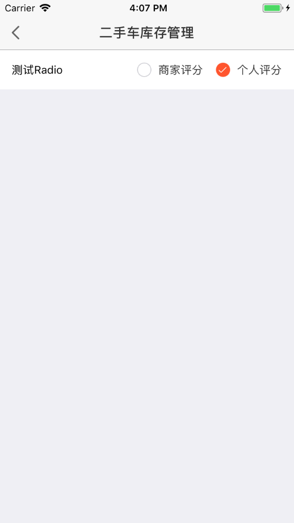
Radio單選框
1、功能說明
用於在多個備選項中選中單個狀態。
Radio 所有選項預設可見,方便使用者在比較中選擇,因此選項不宜過多
2、元件效果
3、程式碼演示
import React, { Component } from "react";
import { Alert, View, Text, StyleSheet, TouchableOpacity, Image, ScrollView } from "react-native";
import { Radio } from "@/rn-design";
const RadioButton = Radio.Button;
const styles = StyleSheet.create({
    content: {
        flexDirection: "row",
        alignItems: "center",
        paddingHorizontal: 15,
        backgroundColor: "#fff",
        justifyContent: "space-between"
    },
    radioContent: {
        flexDirection: "row",
        alignItems: "center"
    },
    innerStyle: {
        height: 50
    }
});

export default class DemoTest extends Component {
    constructor(props) {
        super(props);
        this.state = {
            radioData: [
                { content: "商家評分", value: "1", disabled: false },
                { content: "個人評分", value: "2", disabled: false }
            ],
            selected: 2
        };
    }

    componentDidMount() {}

    render() {
        // console.log(RadioButton);
        return (
            <View>
                <View style={styles.content}>
                    <View>
                        <Text>測試Radio</Text>
                    </View>
                    <Radio
                        style={styles.radioContent}
                        dataOption={this.state.radioData}
                        options={{ value: "value", text: "content", disabled: "disabled" }}
                        selectedValue={this.state.selected}
                        disabledAll={false}
                        innerStyle={styles.innerStyle}
                        onChange={(item) => {
                            console.log(item);
                        }}
                        // txtColor="#ff552e"
                    />
                </View>
                {/* <RadioButton /> */}
            </View>
        );
    }
}
4、API
| 引數 | 說明 | 型別 | 預設值 |
|---|---|---|---|
| style | 當前Radio group的父級樣式 | object | 無 |
| dataOption | Radio渲染當前Radio的資料 | array | 無 |
| options | 匹配Radio元件渲染時的text和value值(必填) { value:“對應dataOption中確定當前唯一標識的key”, text:“對應dataOption中要展示的文案”, disabled:“對應dataOption中當前選中是否禁用的標識,如果dataOption中沒有改屬性,預設全部是false,radio無禁用狀態” } | object | option:{value:“value”, text:“text”, disabled:“disabled”} |
| selectedValue | 用於設定當前選中的值,也可以設定預設值 | any | 無 |
| disabledAll | 是否禁用全部Radio | boolean | false |
| seledImg | Radio選中圖示 傳值示例:{uri:"…"} 不支援本地圖片 | object | - |
| selImg | Radio未選中圖示 傳值示例:{uri:"…"} 不支援本地圖片 | object | - |
| innerStyle | 單個Radio樣式模組 | Object | - |
| txtColor | Radio文案顏色 | string | - |
| onChange | 選項變化時的回撥函式 | function | 無 |
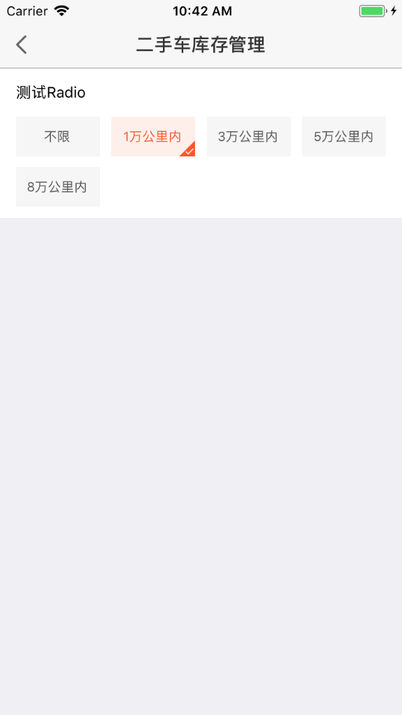
RadioButton
1、元件效果
2、程式碼演示
import React, { Component } from "react";
import { Alert, View, Text, StyleSheet, TouchableOpacity, Image, ScrollView } from "react-native";
import { Radio } from "@/rn-design";
const RadioButton = Radio.Button;
const styles = StyleSheet.create({
    content: {
        // flexDirection: "row",
        // alignItems: "center",
        paddingHorizontal: 15,
        backgroundColor: "#fff"
        // justifyContent: "space-between"
    },
    radioContent: {
        flexDirection: "row",
        alignItems: "center"
    },
    innerStyle: {
        height: 50
    }
});

export default class DemoTest extends Component {
    constructor(props) {
        super(props);
        this.state = {
            radioBtn: [
                { text: "不限", value: "0" },
                { text: "1萬公里內", value: "0_1" },
                { text: "3萬公里內", value: "0_3" },
                { text: "5萬公里內", value: "0_5" },
                { text: "8萬公里內", value: "0_8" }
            ],
            selected: "0_1"
        };
    }

    componentDidMount() {}

    render() {
        return (
            <View>
                <View style={styles.content}>
                    <View style={{ height: 45, justifyContent: "center" }}>
                        <Text>測試Radio</Text>
                    </View>
                    <RadioButton
                        dataOption={this.state.radioBtn}
                        options={{ value: "value", text: "text", disabled: "disabled" }}
                        selectedValue={this.state.selected}
                        onChange={(item) => {
                            console.log(item);
                        }}
                        size={[78, 37]}
                        // seledImg={require("./../img/filter/[email protected]")}
                    />
                </View>
            </View>
        );
    }
}
3、API
| 引數 | 說明 | 型別 | 預設值 |
|---|---|---|---|
| dataOption | Radio渲染當前Radio的資料 | array | 無 |
| options | 匹配Radio元件渲染時的text和value值(必填) { value:“對應dataOption中確定當前唯一標識的key”, text:“對應dataOption中要展示的文案”, disabled:“對應dataOption中當前選中是否禁用的標識,如果dataOption中沒有改屬性,預設全部是false,radio無禁用狀態” } |
object | option:{value:“value”, text:“text”, disabled:“disabled”} |
| selectedValue | 用於設定當前選中的值,也可以設定預設值 | any | 無 |
| disabledAll | 是否禁用全部Radio | boolean | false |
| seledImg | Radio選中圖示 傳值示例:{uri:"…"} 不支援本地圖片 | object | - |
| onChange | 選項變化時的回撥函式 | function | 無 |
| txtColor | Radio字型顏色 | string | “#555555” |
| activeTxtColor | Radio選中字型顏色 | string | “#FF552E” |
| backgroundColor | Radio按鈕塊背景顏色 | string | “#F6F6F6” |
| activeBackgroundColor | Radio按鈕塊選中背景顏色 | string | “#FFEFEB” |
| size | Radio按鈕塊大小 如[80,38] | int[] | [78,37] |
原始碼地址:
https://github.com/gongchenghuigch/rn-design/tree/master/radio