
python資料視覺化seaborn(一)—— 整體樣式與調色盤
很久之前對seaborn有過一些涉及但是沒有深入探究,這次有趁著有資料視覺化的需求,就好好學一學
Seaborn其實是在matplotlib的基礎上進行了更高階的API封裝,從而使得作圖更加容易,在大多數情況下使用seaborn就能做出很具有吸引力的圖,為資料分析提供了很大的便利性。但是應該把Seaborn視為matplotlib的補充,而不是替代物。
這次就從最基本的圖示風格和調色盤開始,學習seaborn。
圖表風格(style)設定
# 利用 matplotlib建立一個正弦函式及圖表
def sinplot(flip=1):
x = np.linspace( 
sns.set() 設定樣式引數
seaborn.set(context =‘notebook’,style =‘darkgrid’,palette =‘deep’,font =‘sans-serif’,font_scale = 1,color_codes = True,rc = None)
sns. 
set_style() 設定圖示風格
seaborn.set_style(style = None,rc = None )
# 切換seaborn圖表風格
# 風格選擇包括:"white", "dark", "whitegrid", "darkgrid", "ticks"
# rc:dict,可選,引數對映以覆蓋預設的seaborn樣式字典中的值 
sns.despine() 設定座標軸
seaborn.despine(fig=None, ax=None, top=True, right=True, left=False, bottom=False, offset=None, trim=False)
# 設定圖表座標軸

sns.set(style='ticks',font_scale=1)
# 設定風格

fig = plt.figure(figsize=(10,12))
plt.subplots_adjust(hspace=0.3)   # 調整子圖間距
# 圖表基本設定

ax1 = fig.add_subplot(3, 1, 1)
sinplot()
sns.despine(ax=ax1)
# 預設隱藏右邊和上邊的座標軸

ax2 = fig.add_subplot(3, 1, 2)
sns.violinplot(data=data)
sns.despine(ax=ax2,offset={'bottom':5,'left':10})
# offset :座標軸是否分開偏移,正值向外側移動,負值向內側移動.可用字典單獨對每個軸設定
# trim: 當為True時,座標軸兩端限制在資料的最大最小值處

ax3 = fig.add_subplot(3, 1, 3)
sns.boxplot(data=data, palette='deep')
sns.despine(ax=ax3,left=True, right= False, trim=True,
           offset={'bottom':10,'right':10})
# top, right, left, bottom:布林型,為True時不顯示

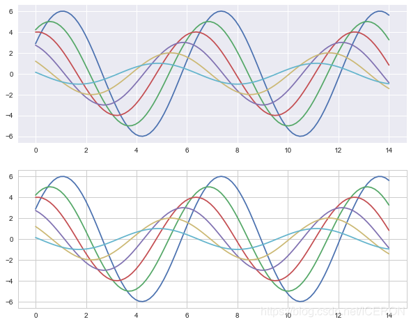
sns.axes_style() 設定子圖風格
# 4、axes_style()
# 設定區域性圖表風格,可學習和with配合的用法

fig = plt.figure(figsize=(10,8))
with sns.axes_style("darkgrid"):
    plt.subplot(211)
    sinplot()
# 設定區域性圖表風格,用with做程式碼塊區分

sns.set_style("whitegrid")
plt.subplot(212)
sinplot()
# 外部表格風格
設定顯示比例尺度 set_context()
seaborn.set_context(context = None,font_scale = 1,rc = None )
# 設定顯示比例尺度
# 選擇包括:'paper', 'notebook', 'talk', 'poster'.這四個是預設的。不會影響整體樣式。
# 預設為notebook

sns.set_context("notebook")
sinplot()
plt.grid(linestyle='--')

圖示顏色設定 color_palette()
sns.color_palette(palette=None, n_colors=None, desat=None)
我們選擇顏色常常依據資料特徵來選擇,所以下面就從
分類:彼此間差異較大連續:顏色按照順序漸變發散:中間顏色淺,兩端顏色深
三個調色盤來講解color_palette()函式
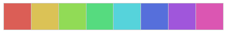
分類調色盤
當你不用區分離散資料的順序時,建議使用分類調色盤
# 預設6種顏色:deep, muted, pastel, bright, dark, colorblind
# n_colors:int,調色盤中的顏色數量
# dasat:float,去飽和度0-1之間


current_palette = sns.color_palette()
sns.palplot(current_palette)
# 當不帶引數的呼叫將返回當前預設顏色迴圈中的所有顏色
# 可以傳入任何matplotlib支援的顏色

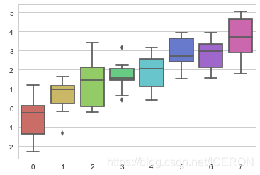
圓形調色系統
當需要6中以上的顏色時,可以在圓形顏色空間中按均勻間隔畫出顏色。
最常見的是使用hls顏色空間。
sns.palplot(sns.color_palette('hls',8))
# 顏色色塊個數為8個
data = np.random.normal(size=(10, 8)) + np.arange(8) / 2
sns.boxplot(data=data,palette=sns.color_palette("hls", 8))
plt.show()
- HLS色調空間:hls_palette([n_colors, h, l, s])
- HUSL色調空間:husl_palette([n_colors, h, l, s])
# 設定亮度,飽和度
# h - 第一個色調
# l - 亮度
# s - 飽和度
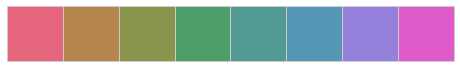
sns.palplot(sns.husl_palette(8, l=.6, s=.7))
# 這個看上去更舒服,更易區分
使用分類Color Brewer調色盤
另一個分類色板來源於Color Brewer(同樣也具有連續色板和發散色板),它也同樣存在於matplotlib colormaps中,但是並沒有得到很好的處理。在Seaborn中,當你呼叫Color Brewer分類色板時,你總能得到離散的顏色,但是這意味著它們在某一點開始了迴圈。
Color Brewer網站的一個很好的功能是它提供了一些關於哪些調色盤是色盲安全的指導
# Color Brewer顏色設定
sns.palplot(sns.color_palette("Paired",8))
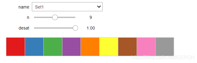
sns.palplot(sns.color_palette("Set1",10))


使用xkcd顏色測量中的命名顏色
xkcd包含了一系列命名RGB顏色。共954種顏色,您現在可以使用xkcd_rgb字典在seaborn中引用它們:
plt.plot([0, 1], [0, 1], sns.xkcd_rgb["pale red"], lw=3)
plt.plot([0, 1], [0, 2], sns.xkcd_rgb["medium green"], lw=3)
plt.plot([0, 1], [0, 3], sns.xkcd_rgb["denim blue"], lw=3)

順序調色盤
當資料範圍從相對較低或不感興趣的值到相對較高或有趣的值時,可以使用連續(順序)調色盤,在kdeplot()和heatmap()函式中常常會用到。
具有大色調偏移的色彩圖往往會引入資料中不存在的不連續性,並且我們的視覺系統無法自然地將彩虹對映到諸如“高”或“低”的定量區別。結果是這些視覺化最終更像是一個謎題,它們模糊了資料中的模式而不是揭示它們
所以對於順序資料,最好使用色調最多相對微妙偏移的調色盤,伴隨著亮度和飽和度的大幅度變化。這種方法自然會吸引人們關注資料的相對重要部分
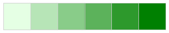
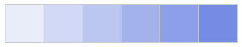
sns.palplot(sns.color_palette("Blues"))
sns.palplot(sns.color_palette("Blues_r"))
# 與matplotlib中一樣,如果您希望反轉亮度漸變,則可以為_r調色盤名稱新增字尾
# 不是所有顏色都可以反轉!!!


順序 cubehelix 調色盤
cubehelix調色盤系統既能亮度線性變化同時也能色調變化的線性色板。這意味著當轉換為黑白(用於列印)或由色盲個人檢視時,色彩對映中的資訊將被保留。
seaborn.cubehelix_palette(n_colors = 6,start = 0,rot = 0.4,gamma = 1.0,hue = 0.8,light = 0.85,dark = 0.15,reverse = False,as_cmap = False )
# 按照線性增長計算,設定顏色

sns.palplot(sns.color_palette("cubehelix", 8))
sns.palplot(sns.cubehelix_palette(8, gamma=2))
sns.palplot(sns.cubehelix_palette(8, start=.5, rot=-.75))
sns.palplot(sns.cubehelix_palette(8, start=2, rot=0, dark=0, light=.95, reverse=True))

# n_colors → 顏色個數
# start → 值區間在[0,3],開始顏色
# rot → float,顏色旋轉角度,可能是(-1,1)之間
# gamma → 顏色伽馬值,>1 較亮,<1 較暗
# dark,light → 值區間0-1,顏色深淺
# reverse → 布林值,預設為False,由淺到深


自定義順序調色盤
對於自定義順序調色盤的簡單介面,您可以使用light_palette()或使用dark_palette(),都是由單一的顏色並生成從淺色或深色去飽和值到該顏色的漸變調色盤。這些函式還伴隨著啟動互動式小部件以建立這些調色盤的功能
seaborn.light_palette(color,n_colors = 6,reverse = False,as_cmap = False,input =‘rgb’ )
seaborn.dark_palette(color,n_colors = 6,reverse = False,as_cmap = False,input =‘rgb’ )
# color: 十六進位制程式碼,html顏色名稱或input空間中的元組
# input: {'rgb','hls','husl',xkcd'}
# 用於解釋輸入顏色的顏色空間。前三個選項適用於元組輸入,後者適用於字串輸入


sns.palplot(sns.light_palette("green"))# 按照green做淺色調色盤
sns.palplot(sns.dark_palette('green', reverse=True))# 按照green做深色調色盤

sns.palplot(sns.light_palette((260, 75, 60), input="husl"))
sns.palplot(sns.dark_palette("muted purple", input="xkcd"))


發散的調色盤
第三類調色盤稱為“發散”。這些用於大低值和高值都很有趣的資料。資料中通常還有明確定義的中點。例如,如果要繪製某個基線時間點的溫度變化,最好使用偏差色圖來顯示相對減少的區域和相對增加的區域。
同樣重要的是要強調使用紅色和綠色應該避免,因為大量潛在的觀眾將無法區分它們
seaborn.diverging_palette(h_neg, h_pos, s=75, l=50, sep=10, n=6,
center=‘light’, as_cmap=False)
# 建立分散顏色
# h_neg, h_pos → 起始/終止顏色值
# s → 值區間0-100,飽和度
# l → 值區間0-100,亮度
# n → 顏色個數
# center → 中心顏色為淺色還是深色“light”,“dark”,預設為light


# Color Brewer庫帶有一組精心挑選的發散色圖
sns.palplot(sns.color_palette("BrBG", 7))

# 當然可以自己定製
sns.palplot(sns.diverging_palette(145, 280, s=85, l=25, n=7))


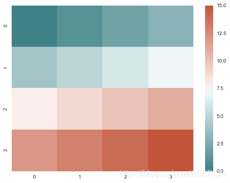
plt.figure(figsize = (8,6))
x = np.arange(16).reshape(4, 4)
cmap = sns.diverging_palette(200, 20, sep=16, as_cmap=True)
sns.heatmap(x, cmap=cmap)
選擇調色盤 choose_colorbrewer_palette()
您可以使用該choose_colorbrewer_palette()函式來播放各種顏色選項,如果希望返回值是可以傳遞給seaborn或matplotlib函式的colormap物件,則可以將as_cmap引數設定為True
seaborn.choose_colorbrewer_palette(data_type, as_cmap=False)
sns.choose_colorbrewer_palette('q')
# sequential:順序,可以用 s 來代替
# diverging:發散, 可以用 d 來代替
# qualitative:分類, 可以用 q 來代替
# Color Brewer的顏色圖:
# Accent, Accent_r, Blues, Blues_r, BrBG, BrBG_r, BuGn, BuGn_r, BuPu,
# BuPu_r, CMRmap, CMRmap_r, Dark2, Dark2_r, GnBu, GnBu_r, Greens, Greens_r, Greys,
#Greys_r, OrRd, OrRd_r, Oranges, Oranges_r, PRGn, PRGn_r,
# Paired, Paired_r, Pastel1, Pastel1_r, Pastel2, Pastel2_r, PiYG, PiYG_r, PuBu, PuBuGn,
#PuBuGn_r, PuBu_r, PuOr, PuOr_r, PuRd, PuRd_r, Purples,
# Purples_r, RdBu, RdBu_r, RdGy, RdGy_r, RdPu, RdPu_r, RdYlBu, RdYlBu_r, RdYlGn, RdYlGn_r,
# Reds, Reds_r, Set1, Set1_r, Set2, Set2_r, Set3,
# Set3_r, Spectral, Spectral_r, Wistia, Wistia_r, YlGn, YlGnBu, YlGnBu_r, YlGn_r, YlOrBr,
# YlOrBr_r, YlOrRd, YlOrRd_r, afmhot, afmhot_r,
# autumn, autumn_r, binary, binary_r, bone, bone_r, brg, brg_r, bwr, bwr_r, cool, cool_r,
# coolwarm, coolwarm_r, copper, copper_r, cubehelix,
# cubehelix_r, flag, flag_r, gist_earth, gist_earth_r, gist_gray, gist_gray_r, gist_heat,
# gist_heat_r, gist_ncar, gist_ncar_r, gist_rainbow,
# gist_rainbow_r, gist_stern, gist_stern_r, gist_yarg, gist_yarg_r, gnuplot, gnuplot2,
# gnuplot2_r, gnuplot_r, gray, gray_r, hot, hot_r, hsv,
# hsv_r, icefire, icefire_r, inferno, inferno_r, jet, jet_r, magma, magma_r, mako,
# mako_r, nipy_spectral, nipy_spectral_r, ocean, ocean_r,
# pink, pink_r, plasma, plasma_r, prism, prism_r, rainbow, rainbow_r, rocket, rocket_r,
# seismic, seismic_r, spectral, spectral_r, spring,
# spring_r, summer, summer_r, terrain, terrain_r, viridis, viridis_r, vlag, vlag_r, winter, winter_r
設定預設的調色盤
類似於color_palette()。set_palette()接受相同的引數,但它會更改預設的matplotlib引數,以便將調色盤應用於所有繪圖。
# 設定調色盤後,繪圖建立圖表

sns.set_style("whitegrid")
fig = plt.figure(figsize=(8,6))

# 設定風格
with sns.color_palette("PuBuGn_d"):
    plt.subplot(211)
    sinplot()

sns.set_palette("husl")
plt.subplot(212)
sinplot()
# 繪製系列顏色
