
css3——transition動畫過渡(transition動畫過渡可作用的屬性),animation動畫鋪墊和@keyframes動畫關鍵幀
css3動畫優點:開啟GPU加速,不會產生動畫佇列,即頻繁點選按鈕時,不會有多個動畫在等待執行;
1. transition: property duration timing-function delay;
是個複合屬性,包括:
transition-property:設定過渡效果的 CSS 屬性,值:all 所有變化的屬性都過渡;某個css屬性或某些css屬性,用逗號隔開屬性
| 值 | 描述 |
|---|---|
| linear | 勻速開始至結束(等於 cubic-bezier(0,0,1,1))。 |
| ease | 慢速開始,然後變快,然後慢速結束(cubic-bezier(0.25,0.1,0.25,1))。 |
| ease-in | 慢速開始(等於 cubic-bezier(0.42,0,1,1))。 |
| ease-out | 慢速結束(等於 cubic-bezier(0,0,0.58,1))。 |
| ease-in-out | 慢速開始和結束(等於 cubic-bezier(0.42,0,0.58,1))。 |
| cubic-bezier(n,n,n,n) | 在 cubic-bezier 函式中定義自己的值。可能的值是 0 至 1 之間的數值。 |
理解:transition作用的屬性,當其屬性值發生變化,比如:hover時;js點選後值的改變等等,凡是屬性值發生變化,均會觸發transition過渡屬性的過渡效果。
transition 動畫過渡可作用的屬性:
| background-color | background-position | border-bottom-color | border-bottom-width | border-left-color | border-left-width |
| border-right-color | border-right-width | border-spacing | border-top-color | border-top-width | bottom |
| clip | color | font-size | font-weight | height | left |
| letter-spacing | line-height | margin-bottom | margin-left | margin-right | margin-top |
| max-height | max-width | min-height | min-width | opacity | outline-color |
| outline-width | padding-bottom | padding-left | padding-right | padding-top | right |
| text-indent | text-shadow | vertical-align | visibility | width | word-spacing |
| z-index | 等等等 |
2. animation動畫鋪墊和@keyframes動畫關鍵幀
animation屬性:複合屬性。會按照@keyframes動畫關鍵幀裡面指定的幀狀態而過渡執行
| 屬性 | 屬性值 |
| animation-name | @keyframes的名字 |
|
animation-duration |
動畫過渡時間 |
| animation-timing-function | 動畫過渡函式 |
| animation-delay | 動畫過渡延遲時間 |
| animation-direction | 動畫過渡方向 |
| animation-iteration-count | 動畫過渡次數 infinite(無限次) | number(次數) |
|
animation-fill-mode animation-play-state |
動畫開始前和結束後的操作 動畫播放狀態,running(播放) | paused(暫停) |
用法:
@keyframes + 關鍵幀名字 :規定開始、中間過程、結束時的屬性狀態;
選擇器中呼叫animation屬性,animation屬性設定:某個關鍵幀名字 、過渡時間、過渡函式、運動次數、運動方向
(1)@keyframes + 關鍵幀 第一種寫法:from 和 to
    <style>
        .demo{
            position: absolute;
            top: 100px;
            left: 100px;
            width: 100px;
            height: 100px;
            background: green;
            animation: move 3s linear;
        }
        @keyframes move{
            from{
                background: red;
            }
            to{
                background: blue;
            }
        }
    </style>
背景顏色:動畫起始值:red;動畫終止值:blue;當整個animation結束後,背景顏色為green;
如果不設定form,那麼動畫起始值為green,動畫終止值:blue;當整個animation結束後,背景顏色為green
注意:如果不設定背景顏色,那麼在動畫結束後,背景顏色為空白。
(2)@keyframes + 關鍵幀 第二種寫法:百分比
注意:0% 和 100% 分別對應 form和to;百分比對應的是時間
比如:
    <style>
        .demo{
            position: absolute;
            top: 100px;
            left: 100px;
            width: 100px;
            height: 100px;
            background: green;
            animation: move 3s linear;
        }
        @keyframes move{
            0%{
                background: red;
            }
            50%{
                background: yellow;
            }
            100%{
                background: blue;
            }
        }
    </style>
結果:背景顏色:動畫起始值:red,中途變向yellow,動畫終止值blue;動畫結束後,背景顏色:green;
注意:如果不設定背景顏色,動畫結束後的背景顏色為空白;
動畫次數:n 播放次數、infinite無限次
動畫方向:normal預設值正常播放、reverse 反向播放、 alternate 動畫在奇數次(1 3 5...)正向播放,在偶數次反向播放、
alternate-reverse 動畫在偶數次(2 4 6...)正向播放,在奇數次反向播放。
    <style>
        .demo{
            position: absolute;
            top: 100px;
            left: 100px;
            width: 100px;
            height: 100px;
            background: green;
            animation: move 3s linear 10 reverse;
        }
        @keyframes move{
            0%{
                background: red;
            }
            50%{
                background: yellow;
            }
            100%{
                background: blue;
            }
        }
    </style>
(3)播放和停止:
屬性:animation-play-state: running(播放) | paused(暫停)
動畫的播放和停止需要結合js來控制animation-play-state屬性,進而控制動畫的播放和暫停
<!DOCTYPE html>
<html lang="en">
<head>
    <meta charset="UTF-8">
    <meta name="viewport" content="width=device-width, initial-scale=1.0">
    <meta http-equiv="X-UA-Compatible" content="ie=edge">
    <title>Document</title>
    <style>
        .demo{
            position: absolute;
            top: 100px;
            left: 100px;
            width: 100px;
            height: 100px;
            background: green;
            animation: move 3s linear 10 reverse;
        }
        @keyframes move{
            0%{
                background: red;
            }
            50%{
                background: yellow;
            }
            100%{
                background: blue;
            }
        }
    </style>
</head>
<body>
    <div class="demo"></div>
    <button id="btn">播放/暫停</button>
    <script>
        var oDiv = document.getElementsByClassName('demo')[0];
     var flag = true;
     btn.onclick = function(){
         if(flag){
             flag = false;
             oDiv.style.animationPlayState = 'paused';
         }else {
             flag = true;
             oDiv.style.animationPlayState = 'running';
         }
     }
    </script>
</body>
</html>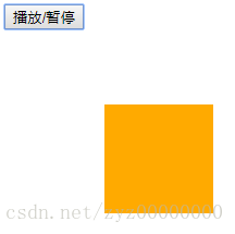
注意:播放或暫停,會使整個動畫過程暫停在某一時間點 或 在該時間點上繼續播放
(4)關鍵幀的起始位置和終止位置
animation-fill-mode:屬性定義動畫在開始之前和結束之後發生的操作,主要有四個值:
none:預設值,在動畫結束後,屬性值會回到原來設定的值,如果原來沒有設定該值,那麼該值為空。
forwards:動畫結束後,屬性值會變成關鍵幀的最後一幀
backwards:在動畫關鍵幀的第一幀,延遲等待,再進行動畫過渡(運動);正常情況下,物體在其實位置延遲等待後,再進行動畫過渡。
both:動畫過渡同時具有forwards和backwards效果
比如:animation: move 3s linear infinite reverse forwards running;