css佈局之2邊固定寬度,中間自適應
阿新 • • 發佈:2018-12-05
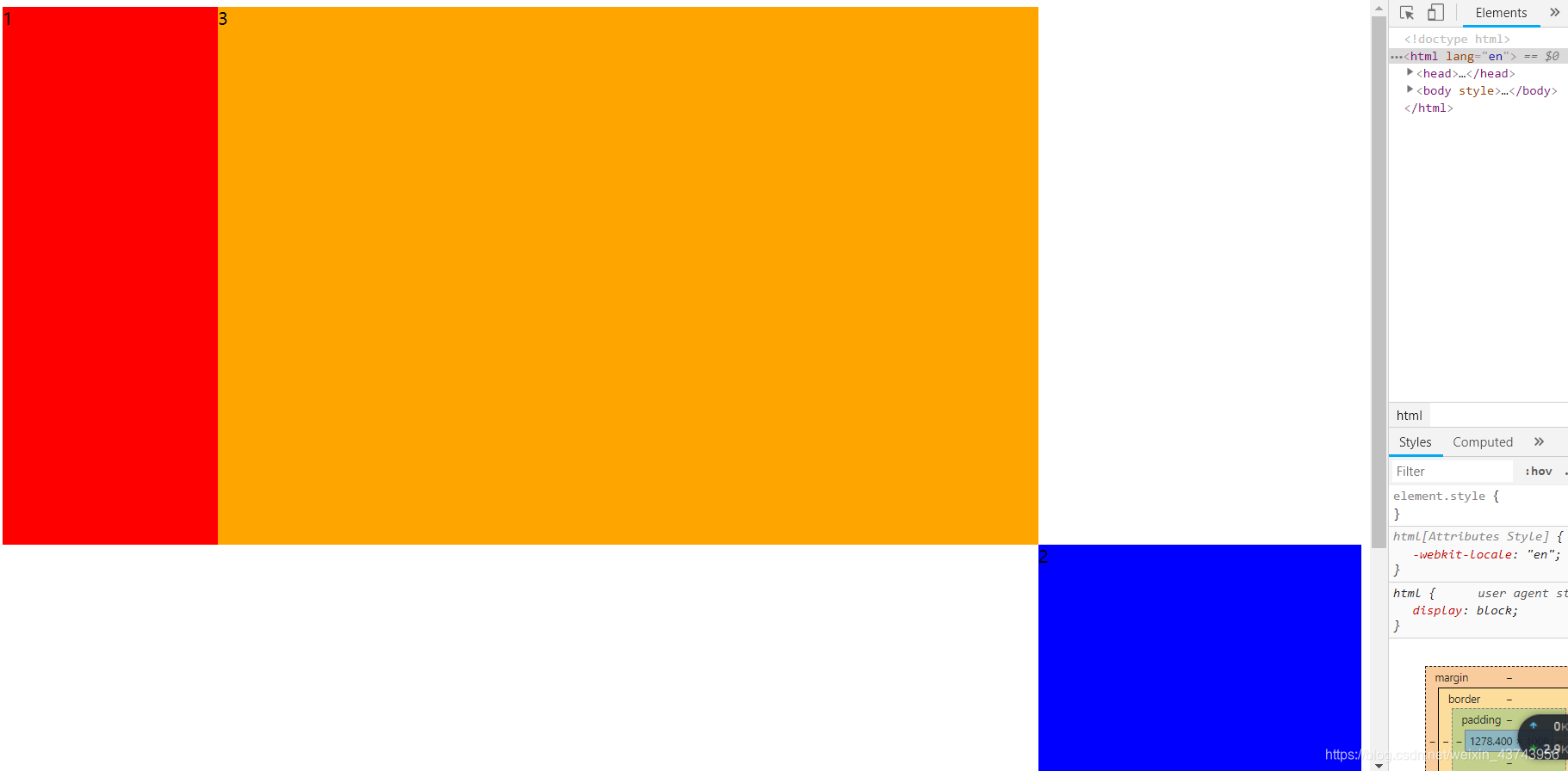
左右兩列分別左浮動和右浮動並給一個固定寬度,中間不浮動,也不設定寬度。
<div class="left">1</div>
<div class="right">2</div>
<div class="center">3</div>

 <style>
        .left{
            width: 200px;
            background: red;
            float: left;
        }
        .right{
            width: 300px;
            background: blue;
            float: right;
        }
        .center{
            margin:0 300px 0 200px;
            background: orange;
        }
        div{
            min-height: 500px;
        }
    </style>
有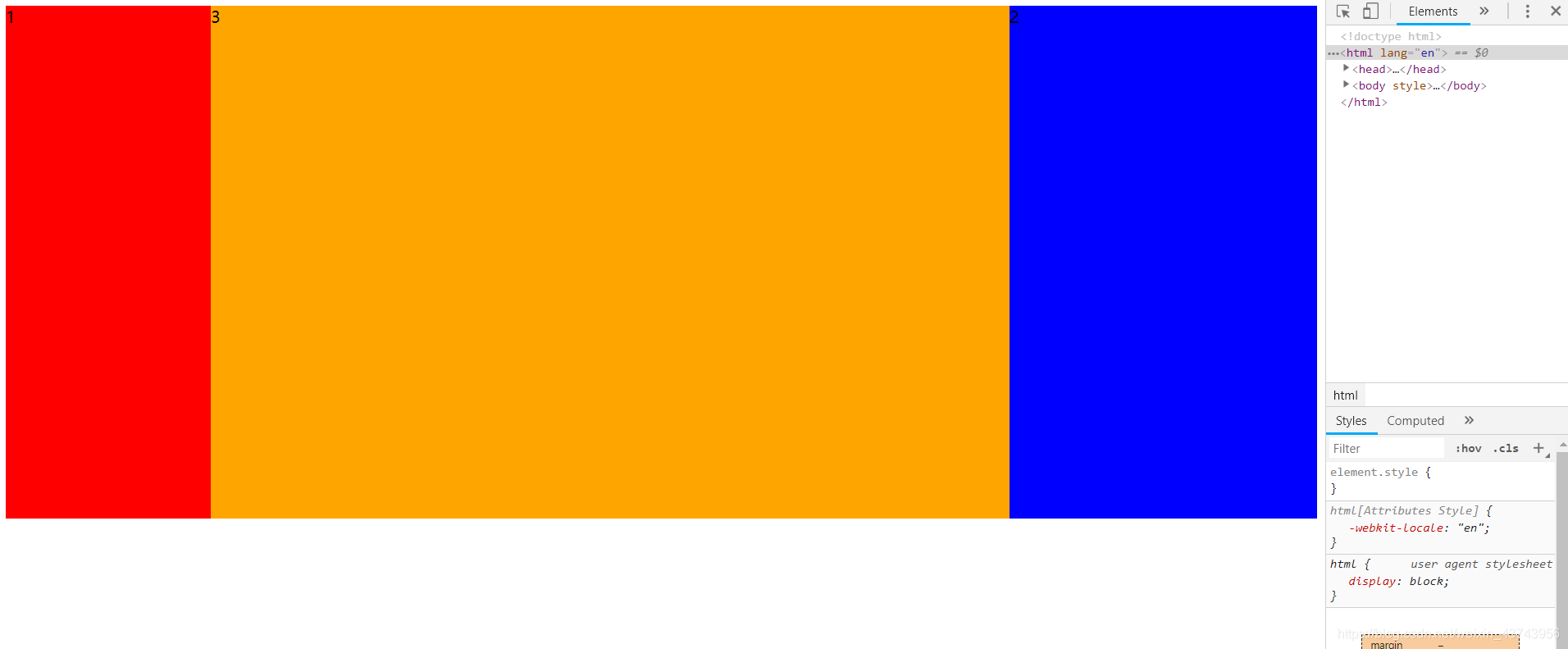
補充:注意<div class="left">1</div> <div class="center">3</div> <div class="right">2</div>
這樣寫的,因為center為塊級元素,會佔一行,就算right浮動了,因為center佔一行,會被擠到下一層。要注意