R語言-畫散點圖
阿新 • • 發佈:2018-11-27
plot()函式
plot(cars$dist~cars$speed, # y~x
main="XXX", # 畫標題
xlab="XXX", #X座標軸標題
ylab="XXX", #Y座標軸標題
xlim=c(0,30), #設定X軸範圍為從0到30
ylim=c(0,140), #設定Y軸範圍為從0到140
xaxs="i", #設定X軸風格internal
yaxs="i", #設定Y軸風格internal
col="red", #設定“散點”的顏色為紅色
pch=19) #設定散點的形狀為實心圓點
示例
資料:R自帶資料集cars
>cars
>plot(cars$dist~cars$speed)
結果如下圖:

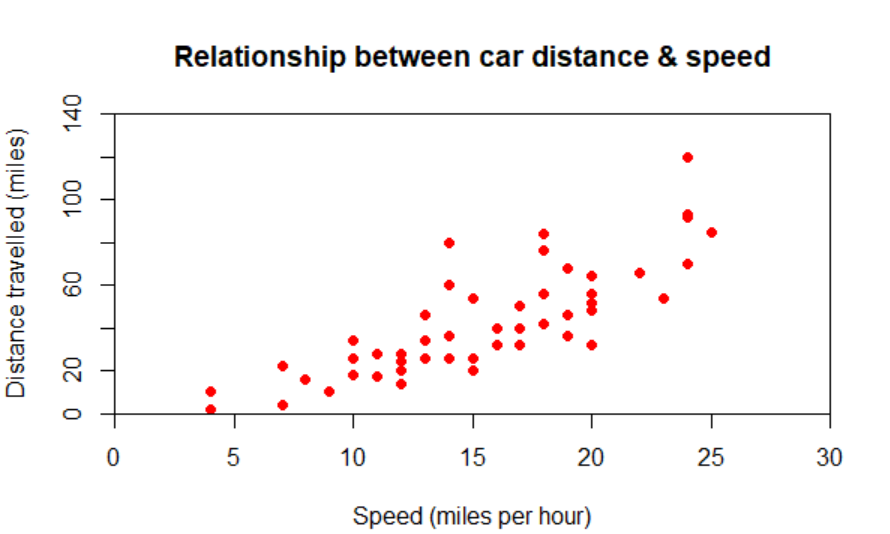
>cars
> plot(cars$dist~cars$speed,                                              # y~x
+ main="Relationship between car distance & speed",                       # 畫標題
+ xlab="Speed (miles per hour)",                                          #X座標軸標題
+ ylab="Distance travelled (miles)",                                      #Y座標軸標題
+ xlim=c(0,30),                                                           #設定X軸範圍為從0到30
+ ylim=c(0,140),                                                          #設定Y軸範圍為從0到140
+ xaxs="i",                                                               #設定X軸風格internal
+ yaxs="i",                                                               #設定Y軸風格internal
+ col="red",                                                              #設定“散點”的顏色為紅色
+ pch=19)                                                                 #設定散點的形狀為實心圓點
結果如下圖: