PS學習記錄2--PS網頁設計教程XII——在PS中建立專業的web2.0的網頁佈局 第一章
作為編碼者,美工基礎是偏弱的。我們可以參考一些成熟的網頁PS教程,提高自身的設計能力。套用一句話,“熟讀唐詩三百首,不會作詩也會吟”。
本系列的教程來源於網上的PS教程,都是國外的,全英文的。本人嘗試翻譯這些優秀的教程。因為翻譯能力有限,翻譯的細節上還有待推敲,希望廣大網友不吝賜教。
約定:
1、本文的軟體是Photoshop CS5版本
2、原教程的截圖是英文的,本人在重新制作的基礎上,重新截了中文版的圖
3、原文中有些操作沒有給出引數。本人在反覆測試的情況下測定了一些引數,以紅色的文字顯示。有些錯誤的引數,直接以紅色文字顯示正確的引數
例如:(90,22,231,77)
例如:(90,22),表示矩形的左上角的座標是(90,22),矩形的其他兩個引數教程裡已經指定
4、在教程的最後會附上本人的心得。有些是對教程中的一些步驟的優化等。
In this Photoshop tutorial we’re going to learn how to create a web 2.0 layout, As we go through the tutorial we’ll deal with so many Photoshop techniques. Seems kind of long? that’s because it’s very detailed. I assure you’ll find easy to follow and to get done, just give it a try!
在本PS教程中,我們將學習如何建立web 2.0的佈局,隨著我們通過本教程我們會學習很多PS技巧。似乎太長了嗎?這是因為它非常詳細。我保證你照著做會發現很容易,試試看!
Step 1
To keep everything aligned we’re going to use 960s Grid System (Get it from here) once downloaded open up the file “960_grid_24_col.psd”.
We’ll start by creating layer from background, right-click on the layer “Background”, then choose Layer From Background. and call it “bg”.
步驟1
為了對齊元素,我們打算用960s Grid System(從這獲得),下載後開啟960_grid_24_col.psd檔案
一開始從背景建立圖層,在Background上右鍵,選擇背景圖層,命名為bg
由於本翻譯不使用960s Grid System,故本步改為新建文件,尺寸:1020px*1800px

Step 2
As we’ll use guides so much, we need to view our Rulers. In order to do that go to View > Rulers.
步驟2
我們需要參考線,我們需要顯示我們的標尺。為此,點選:檢視 > 標尺
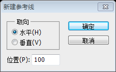
Step 3
We need to set lower borders for the header area, therefore we’ll drag a new horizontal guide after 100px. go to View > New Guide, Position: 100.
步驟3
我們需要設定頭部區域的邊框,為此在100px的位置拖動一條水平的參考線。點選:檢視 > 新建參考線,位置:100
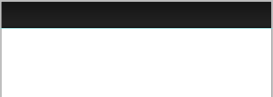
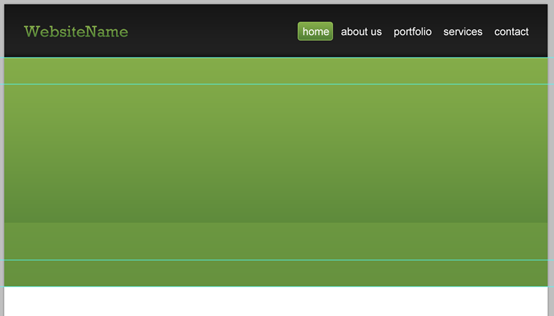
Step 4
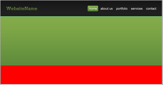
Let’s create our header. we’ll start by creating a selection of 1020x100px. then click Shift+Backspace to fill it (with any color just for now).
步驟4
現在建立頭部區域。我們首先建立一個1020px*100px的選區。然後按Shift+Backspace填充(用當前的前景色填充)
建議:不太常見的做法,一般用矩形工具建立一個矩形(0,0,1020,100),區別是矩形工具會新建一個圖層
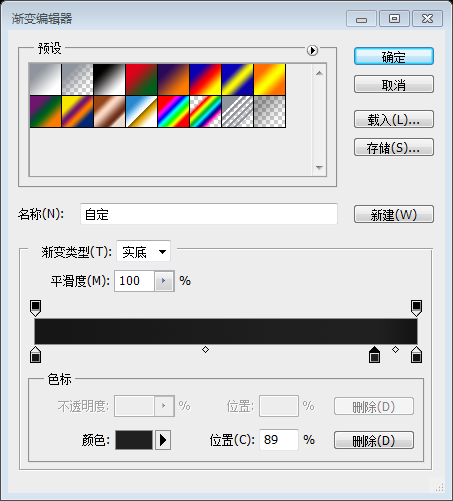
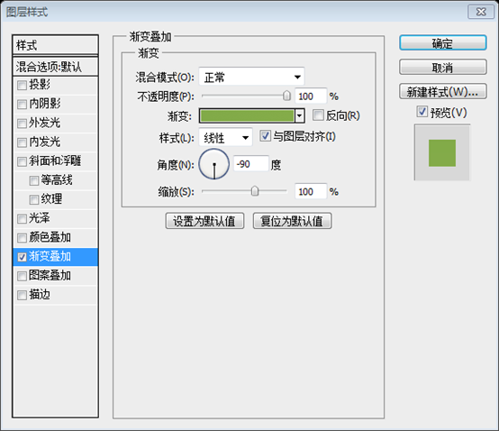
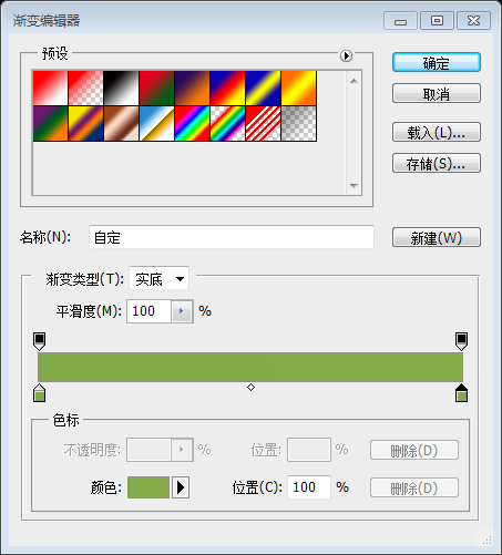
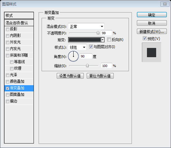
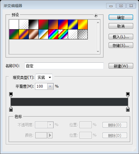
Give it a Gradient Overlay according to the following image:
按照下圖設定矩形的漸變疊加的圖層樣式
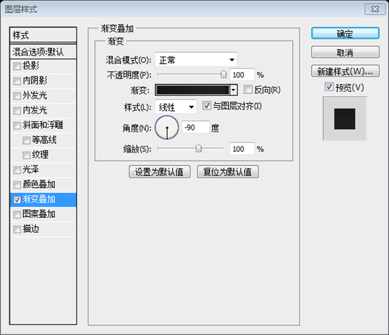
漸變編輯器的顏色:#161616,#202020,#131313
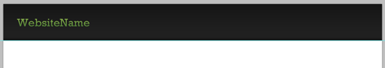
Now call this layer: “header_bg”.
命名此圖層為header_bg
Step 5
Write your Web site title with these settings:
- Font Family: Rockwell (get it from here)
- Font size: 30px
- Font weight: Regular
- Anti-aliasing setting: Smooth
- Color: Won’t matter, cause we’re gonna give it a Gradient Overlay
步驟5
按照下面的設定,用文字工具新增網站的標題
- 字型:Rockwell
- 字型大小:30px
- 字型樣式:Regular
- 消除鋸齒方式:平滑
- Color: 不需設定,因為我們要新增漸變疊加
Now add a Gradient Overlay to your text with the following settings:
現在按照下面的設定對你的文字新增漸變疊加

漸變編輯器的顏色:#528037,#84ac49

To align your Web site title with the header background; Select your title layer and “header_bg” layer then click on Align vertical centers.
為了對齊網站的標題在頭部的背景,選擇你的標題圖層和header_bg圖層,然後點選垂直居中對齊(點選:圖層 > 對齊 > 垂直居中)
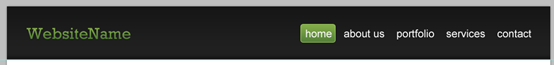
Step 6
Write your navigation text with these settings:
- Font Family: Arial
- Font size: 20px
- Font weight: Regular
- Anti-aliasing setting: Smooth
- Color: #ffffff
步驟6
按照下面的設定新增導航文字:
- 字型: Arial
- 字型大小: 20px
- 字型樣式: Regular
- 消除鋸齒樣式:平滑
- 顏色: #ffffff
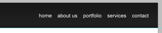
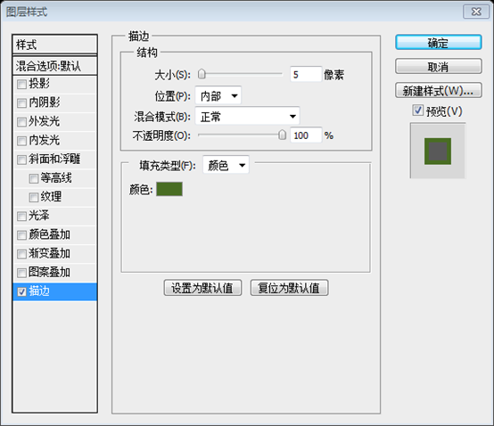
Create a rounded rectangle which will represent a hovered link. it should be about 65x35px size – 5px radius, (fill it with any color for now).
對懸停的連結新增一個圓角矩形(551,33)。尺寸:65px*35px,半徑5px,(填充任意顏色)
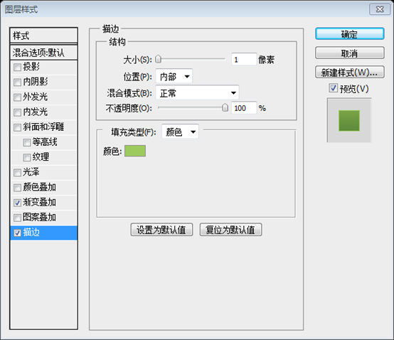
Give it a Stroke and Gradient Overlay according to the following image:
按照下圖對圓角矩形設定描邊和漸變疊加的圖層樣式:
描邊的顏色: #9dca5d
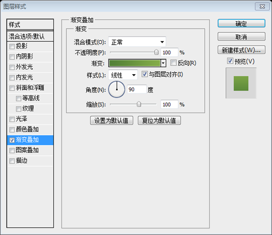
漸變編輯器的顏色:#528037,#84ac49

Before we move to the next step, just make sure to keep your layers well-organized, Here’s how mine looks!
在做下一步之前,要確保圖層的組織嚴密(將這些圖層歸併到header組),這裡是我做的樣子 !
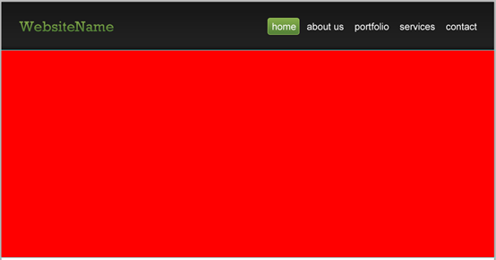
Step 7
It’s time to create the featured designs area. we’ll start by setting our lower borders by adding a new horizontal guide after 430px.
步驟7
該建立特色區域了。為了設定邊框,在之前的水平參考線下方的430px處新增一條水平參考線。
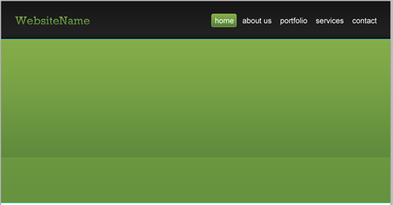
Create a selection of 1020x430px as a background for the featured designs area. and fill it with any color.
給特色區域新增背景,建立一個1020px*430px的選區。用任意顏色填充。
建議:用矩形工具新建一個矩形(0,100,1020,430)
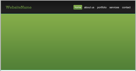
Then give it a Gradient Overlay with the following settings:
然後按照下圖設定漸變疊加:
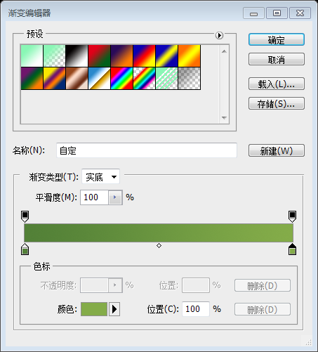
漸變編輯器的顏色:#528037,#84ac49

Now let’s create the glaze effect! create a selection of 1020x120px, fill it with any color.
現在建立亮釉效果!建立一個選區1020px*120px,用任意顏色填充。
建議:用矩形工具新建矩形(0,410,1020,120)
And then add a Gradient Overlay. use the image below for reference.
然後按照下圖設定漸變疊加
漸變編輯器的顏色: #81aa48,#84ac49
Now reduce this layer opacity to 40%
調整該圖層的不透明度為40%
Step 8
Let’s add some touches! with the Single Row Marquee Tool create a 1px selection and align it like the following:
現在新增一些潤色!用單行選擇工具建立一個1px的選區,如下對齊
Set your foreground color to #acd86e then click on Shift+Backspace to fill it; make sure to use foreground color as a filling option.
設定你的前景色為#acd86e,然後按Shift+Backspace填充選區;確保填充模式是前景色。
建議:用直線工具建立一條直線(0,100,1020,1),顏色: #acd86e。

I guarantee you’ll have perfect pixel details
我保證你會有完美的單畫素元件
We’re done creating the background elements. so make sure to give them ideal names, organize them, and group them together.
我們完成背景元素。一定要給他們理想的名稱,組織他們,把他們歸併到一組。
Step 9
Let us be more accurate! drag two new guides according to the following image
步驟9
為了更精確的定位!如下圖拖動兩條參考線(分別在之前的兩條參考線的內側50px處)
Write some welcoming words with these settings:
- Font Family: Rockwell
- Font size: 40px
- Font weight: Regular
- Anti-aliasing setting: Sharp
- Color: #f4f4f4
按照下面的設定新增歡迎文字:
- 字型: Rockwell
- 字型大小: 40px
- 字型樣式: Regular
- 消除鋸齒樣式:銳利
- 顏色: #f4f4f4
I personally have written: “Here’s our brand new work. Oops Welcome!” ;) but we need to emphasize the word “Welcome!” in somehow. so basically we’ll give it a Gradient Overlay. follow up with the image
我們寫好:Here’s our brand new work. Oops Welcome!。;)。 但我們需要以某種方式強調Welcome一詞。因此,我們會按照下圖給它新增漸變疊加。
為了完美的解決此步,用文字工具分別寫出Here’s our brand new work.和Oops和Welcome!,然後對Welcome!新增漸變疊加的圖層樣式
漸變編輯器的顏色: #2f3032,#2f3336

Now drag two new horizontal guides according to the following image
現在按照下圖拖動兩條新的水平參考線(一條和文字的底部對齊,另一條在之前的參考線下方50px處),通過計算兩條參考線的位置大致是220px和270px

Before we say goodbye to this step, just make sure to organize your text layers.
在和本步驟說拜拜之前,組織你的文字圖層(歸併到一組)
Step 10
Start by creating a selection of 250x150px (fill it with any color), this will be our image holder.
Call this layer “pic_holder” and try aligning it like the image above.And give it a Stroke
步驟10
建立一個選區,尺寸:250px*150px(任意色填充),這將是我們的圖片塊
命名此圖層為pic_holder,按照下圖移到合適的位置,並按照下圖新增描邊
建議:用矩形工具新建一個矩形(100,299),並按照下圖新增描邊的圖層樣式
描邊的顏色:#496d23

Let’s add an image of a featured design, to do so go to File > Place and select an image. call its layer “pic”, and make sure to put it right above the layer “pic_holder”.
Right-click on “pic” layer and choose Create Clipping Mask.
在特色區域新增一個圖片,為此,點選:檔案 > 置入,選擇一個檔案。命名此圖層為pic,確保pic圖層在pic_holder圖層的上方。
右鍵pic圖層,並選擇建立剪貼蒙版