circos 視覺化手冊-line plot 篇
歡迎關注微信公眾號《生信修煉手冊》!
line plot在circos中的用法比較簡單,示例如下:

對於折線圖而言,調整外觀的屬性有以下4個
1. thickness
thickness 控制線條的粗細
2. color
color 控制線條的顏色
3. fill_color
fill_color控制填充色,在折線的下方進行顏色填充
4. max_gap
在直線圖中,會看到如下所示的分割線,max_gap的作用就是設定分割線的間距,max_gap = 1u 代表每隔1個單位畫一條分割線,其用法和ticks類似

控制位置的屬性在前面的文章中我們已經介紹過了,這裡在重複一遍。
r0和r1分別設定圓環的內徑和外徑,max和min設定y軸的最大值和最小值,orientation控制y軸0點的位置,orientation = in代表 y = 0 位於r1上;orientation = out表示y = 0位於r0 上;z代表優先順序,數值越大,優先順序越高,當兩個折線圖重疊時,優先順序高的會有先顯示。
與backgrounds, axes, rules的結合使用,在scatter plot中,我們也介紹過了,今天解鎖一種axes的新用法,程式碼如下
在之前的文章中,我們看到了用y0, y1指定範圍,再用spacing引數設定間隔的用法, 這種用法可以方便的設定多條軸線;今天的這個例子中,通過position
最後放一張line plot的示例,在下圖中,除去染色體外,包括3個line plot; 最內圈的line plot有3種填充色,背景色也有3種,另外兩圈的line plot中,其axes的定義就是使用了position的用法,可以看到其軸線非常少,只有2,3條;最內圈的line plot的軸線則採用spacing的用法,其軸線非常多,而且均勻分佈

完整程式碼如下
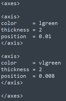
<<include colors_fonts_patterns.conf>>

<<include ideogram.conf>>
<<include ticks.conf>>

<image>
<<include etc/image.conf>>
</image>

karyotype   = data/karyotype/karyotype.human.txt

chromosomes_units = 1000000
chromosomes       = hs1 # ;hs2;hs3
chromosomes_display_default = no

<plots>

type      = line
thickness = 2

<plot>

max_gap = 1u
file    = data/6/snp.density.250kb.txt
color   = vdgrey
min     = 0
max     = 0.015
r0      = 0.5r
r1      = 0.8r

fill_color = vdgrey_a3

<backgrounds>
<background>
color     = vvlgreen
y0        = 0.006
</background>
<background>
color     = vvlred
y1        = 0.002
</background>
</backgrounds>

<axes>
<axis>
color     = lgrey_a2
thickness = 1
spacing   = 0.025r
</axis>
</axes>

<rules>

<rule>
condition    = var(value) > 0.006
color        = dgreen
fill_color   = dgreen_a1
</rule>

<rule>
condition    = var(value) < 0.002
color        = dred
fill_color   = dred_a1
</rule>

</rules>

</plot>

# outside the circle, oriented out
<plot>

max_gap = 1u
file    = data/6/snp.density.txt
color   = black
min     = 0
max     = 0.015
r0      = 1.075r
r1      = 1.15r
thickness = 1

fill_color = black_a4

<axes>
<axis>
color     = lgreen
thickness = 2
position  = 0.006
</axis>
<axis>
color     = lred
thickness = 2
position  = 0.002
</axis>
</axes>

</plot>

<plot>
z       = 5
max_gap = 1u
file    = data/6/snp.density.1mb.txt
color   = red
fill_color = red_a4
min     = 0
max     = 0.015
r0      = 1.075r
r1      = 1.15r
</plot>

# same plot, but inside the circle, oriented in
<plot>
max_gap = 1u
file    = data/6/snp.density.txt
color   = black
fill_color = black_a4
min     = 0
max     = 0.015
r0      = 0.85r
r1      = 0.95r
thickness   = 1
orientation = in

<axes>

<axis>
color     = lgreen
thickness = 2
position  = 0.01
</axis>

<axis>
color     = vlgreen
thickness = 2
position  = 0.008
</axis>

</axes>


<axis>
color     = vlgreen
thickness = 2
position  = 0.006
</axis>
<axis>
color     = red
thickness = 2
position  = 0.002
</axis>
</axes>

</plot>

<plot>
z       = 5
max_gap = 1u
file    = data/6/snp.density.1mb.txt
color   = red
fill_color = red_a4
min     = 0
max     = 0.015
r0      = 0.85r
r1      = 0.95r
orientation = in
</plot>

</plots>

<<include etc/housekeeping.conf>>
掃描關注微訊號,更多精彩內容等著你!