
pandas 繪圖和視覺化
1. matplotlib api 入門
matplotlib api 函式都位於maptplotlib.pyplot模組中
畫圖的各種方法:
- Figure:畫圖視窗
- Subplot/add_Subplot: 建立一個或多個子圖
- Subplots_adjust:調整subplot周圍的間距
- color/linestyle/marker: 線顏色,線型,標記
- drawstyle:線型選項修改
- xlim: 圖表範圍,有兩個方法get_xlim和set_xlim
- xticks:刻度位置,有兩個方法get_xticks和set_xticks
- xticklabels: 刻度標籤,有兩個方法get_xticklabels和set_xticklabels
- legend: 新增圖例。plt.legend(loc='best')
Figure和Subplot方法
Figure物件:matplotlib的影象都位於Figure物件中,可以用plt.figure建立一個新的Figure.
fig=plt.figure()
plt.show()
這時會出現一個空的視窗。figure有點類似於畫圖需要的畫布
add_subplot:建立一個或多個子圖,即在一個視窗中畫好幾個圖形。
eg:ax2=fig.add_subplot(2,2,1)
#這個的意思是:子圖排列是應該是2X2個(即上下2個),最後一個1是指當前選中的是4個subplot中的第一個(編號從1開始的)。
如果如下:由視窗中會畫3個圖
 ax1=fig.add_subplot(2,2,1)  #選中第一個畫子圖
 ax2=fig.add_subplot(2,2,2)  #選中第二個畫子圖
 ax3=fig.add_subplot(2,2,3)  #選中第三個畫子圖
import json
from pandas import DataFrame,Series
import pandas as pd
import numpy as np
import matplotlib.pyplot as plt

#不能通過空Figure繪圖,必須用add_subplot建立一個或多個subplot才行。
fig=plt.figure()
ax1=fig.add_subplot(2,2,1)
ax2=fig.add_subplot(2,2,2)
ax3=fig.add_subplot(2,2,3)

#"K--"是一個線型選項,用於告訴matplotlib繪製黑色虛線圖
from numpy.random import randn
plt.plot(randn(50).cumsum(),'k--')
_=ax1.hist(randn(100),bins=20,color='k',alpha=0.3)  #柱形圖:hist
ax2.scatter(np.arange(30),np.arange(30)+3*randn(30))  #點狀圖:scatter
plt.show()
plt.subplots:可以建立一個新的Figure,並返回一個含有已建立的subplot物件的Numpy陣列
fig,axes=plt.subplots(2,3)
print axes
#輸出結果如下:
# [[<matplotlib.axes.AxesSubplot object at 0x106f5dfd0>
#   <matplotlib.axes.AxesSubplot object at 0x109973890>
#   <matplotlib.axes.AxesSubplot object at 0x1099f9610>]
#  [<matplotlib.axes.AxesSubplot object at 0x109a60250>
#   <matplotlib.axes.AxesSubplot object at 0x10a13c290>
#   <matplotlib.axes.AxesSubplot object at 0x10a1c3050>]]

#這樣可以輕鬆地對axes陣列進行索引,就好像是一個二維陣列一樣。可以通過sharex和sharey指定
#subplot應該具有相同的X軸或Y軸。在比較相同範圍的資料時,這也是非常實用的,否則,matplotlib
#會自動縮放各圖表的界限
print axes[0,1]
pyplot.subplots的選項
引數 說明
nrows subplot的行數
ncols subplot的列數
sharex 所有subplot應該使用相同的X軸刻度(若調節xlim將會影響所有的subplot)
sharey 所有subplot應該使用相同的Y軸刻度(若調節ylim將會影響所有的subplot)
subplot_kw 用於建立各subplot的關鍵字字典
**fig_kw 建立figure時的其他關鍵字,如plt.subplots(2,2,figsize=(8,6))
Subplots_adjust方法
Subplots_adjust:調整subplot周圍的間距
預設情況下,matplotlib會在subplot外圍留下一定的邊矩,並在subplot之間留下一定的間矩。
間矩跟圖象的高度和寬度有關,因為,如果你調整了影象大小,間距也會自動調整。利用Figure的
subplots_adjust方法可以輕而易舉地修改間矩。它也是個頂級函式。
subplots_adjust(left=None,bottom=None,right=None,top=None,wspace=None,hspace=None)
注:wspace和hspace用於控制寬度和高度的百分比,可以用作subplot之間的間距。
例:調整圖片的間矩,各subplot間矩調為0
import json
from pandas import DataFrame,Series
import pandas as pd
import numpy as np
import matplotlib.pyplot as plt
from numpy.random import randn
fig,axes=plt.subplots(2,2,sharex=True,sharey=True)
for i in range(2): #行軸2個子圖
for j in range(2): #列軸2個子圖
axes[i,j].hist(randn(500),bins=50,color='k',alpha=0.5) #畫每一個圖,先從axes[1,1]即第一行第一列
plt.subplots_adjust(wspace=0,hspace=0)
plt.show()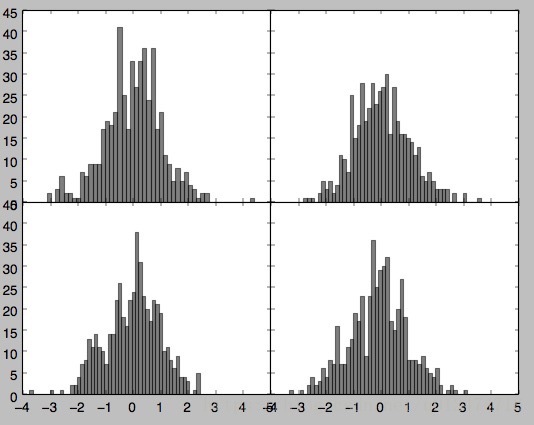
顏色、標記和線型(color,linestyle,marker)
matplotlib的plot函式接受一組X和Y座標,還可以接受一個表示顏色和線型的字串縮寫。
eg:根據x和y繪製綠色虛線
ax.plot(x,y,'g--')
或者:
ax.plot(x,y,linestyle='--',color='g')

#常用的顏色都有一個縮寫詞,要使用其他任意顏色則可以通過指定其RGB值的形式使用(例如:‘#通通CE’)
#完整的linestyle列表可以參見plot的文件。
#線型圖還可以加上一些標記(marker),以強調實際的資料點。
from pandas import DataFrame,Series
import pandas as pd
import numpy as np
import matplotlib.pyplot as plt
from numpy.random import randn
# fig=plt.figure()
plt.plot(randn(30).cumsum(),color='k',linestyle='dashed',marker='o')
plt.show()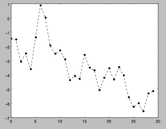
drawstyle:選項修改
import matplotlib.pyplot as plt
from numpy.random import randn

# fig=plt.figure()
data=randn(30).cumsum()
plt.plot(data,'k--',label='Default')
plt.plot(data,'k-',drawstyle='steps-post',label='steps-post')
plt.show()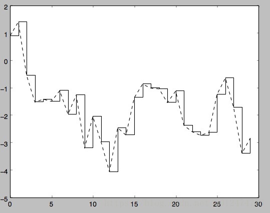
plt.legend(loc='best') #legend是加入圖例。loc是告訴matplotlib要將圖例放在哪,best是不錯的選擇,因為它會選擇不礙事的位置。
要從圖例中去除一個或多個元素,不傳入label或傳入label='_nolegend_'即可

刻度、標籤、圖例(xlim圖表範圍、xticks刻度位置、xticklabels刻度標籤)
對於大多數的圖表裝飾項,其主要實現方式有二:使用過程型的pyplot介面以及更為面向物件的原生matplotlib API.
pyplot介面:xlim(圖表的範圍),xticks(刻度位置),xticklabels(刻度標籤)。它們各自有兩個方法,以xlim為例,
有ax.get_xlim,ax.set_xlim兩個方法。
(1).在呼叫時不帶引數,則返回當前的引數值。例:plt.xlim()返回當前的X軸繪圖範圍(2).呼叫時帶引數,則設定引數值。plt.xlim([0,10])會將X軸的範圍設定為0到10.
import matplotlib.pyplot as plt
from numpy.random import randn

fig=plt.figure()
ax=fig.add_subplot(1,1,1)
ax.plot(randn(1000).cumsum())

#修改X軸的刻度,最簡單的辦法是使用set_xticks和set_xticklabels
ticks=ax.set_xticks([0,250,500,750,1000]) #x軸刻度設定
labels=ax.set_xticklabels(['one','two','three','four','five'],
                          rotation=30,fontsize='small')  #x軸標籤設定
#再用set_xlabel為x軸設定一個名稱,並用set_title設定一個標題
ax.set_title('My First matplotlib plot')  #設定標題
ax.set_xlabel('Stages')   #設定x軸標籤
plt.show()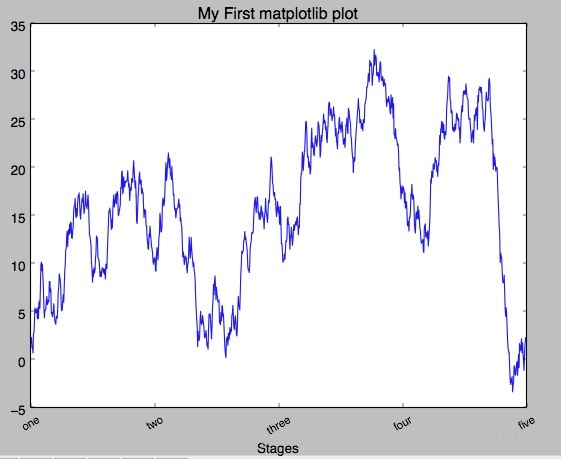
新增圖例(plt.legend(loc='best'))
圖例是另一種用於標識圖表元素的重要工具。新增圖例的方式有二。
(1)最簡單的是在新增subplot的時候傳入label引數,然後呼叫ax.legend()或plt.legend()來自動建立圖例
import matplotlib.pyplot as plt
from numpy.random import randn

#1.新增subplot的時候傳入label引數來新增圖例
fig=plt.figure()
ax=fig.add_subplot(1,1,1)
ax.plot(randn(1000).cumsum(),'k',label='one')
ax.plot(randn(1000).cumsum(),'k--',label='two')
ax.plot(randn(1000).cumsum(),'k.',label='three')
#或者呼叫ax.legend()來建立
# ax.legend(loc='best')
plt.show()

註解以及在subplot上繪圖
# -*- encoding: UTF-8 -*-
import numpy as np
import pandas as pd
import matplotlib.pyplot as plt
import numpy.random as npr
from datetime import datetime


fig = plt.figure()
ax = fig.add_subplot(1,1,1)

data = pd.read_csv('E:\\spx.csv',index_col = 0,parse_dates = True)
spx = data['SPX']
spx.plot(ax = ax,style = 'k-')

crisis_data = [
(datetime(2007,10,11),'Peak of bull market'),
(datetime(2008,3,12),'Bear Stearns Fails'),
(datetime(2008,9,15),'Lehman Bankruptcy')
]

for date,label in crisis_data:
    ax.annotate(label,xy = (date,spx.asof(date) + 50),
        xytext = (date,spx.asof(date) + 200),
        arrowprops = dict(facecolor = 'black'),
        horizontalalignment = 'left',verticalalignment = 'top')
ax.set_xlim(['1/1/2007','1/1/2011'])
ax.set_ylim([600,1800])

ax.set_title('Important dates in 2008-2009 finacial crisis')
plt.show()
#更多關於註解的示例,請看文件

#圖形的繪製要麻煩些,有一些常見的圖形的物件,這些物件成為塊(patch)
#如Rectangle 和 Circle,完整的塊位於matplotlib.patches
#要繪製圖形,需要建立一個塊物件shp,然後通過ax.add_patch(shp)將其新增到subplot中

fig = plt.figure()
ax = fig.add_subplot(1,1,1)

rect = plt.Rectangle((0.2,0.75),0.4,0.15,color = 'k',alpha = 0.3)
circ = plt.Circle((0.7,0.2),0.15,color = 'b',alpha = 0.3)
pgon = plt.Polygon([[0.15,0.15],[0.35,0.4],[0.2,0.6]],color = 'g',alpha = 0.5)

ax.add_patch(rect)
ax.add_patch(circ)
ax.add_patch(pgon)

plt.show()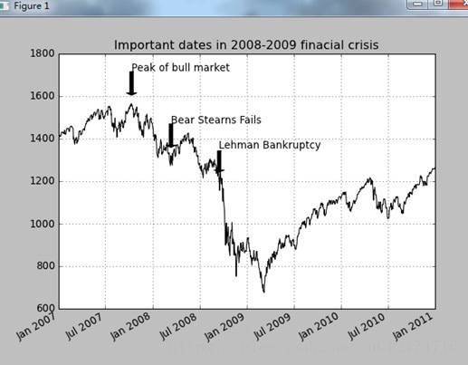
將圖表儲存到檔案(savefig)
plt.savefig可以將當前圖表儲存到檔案。該方法相當於Figure物件的例項方法savefig.
檔案型別是通過副檔名搶斷出來的,例如你使用的是.pdf,就會得到一個pdf檔案。
釋出圖片時最常用到兩個重要的選項是dpi(控制“每英寸點數”解析度)和bbox_inches(可以剪除當前圖表周圍的空白部分)。
例:要得到一張帶有最小白邊且解析度為400dpi的PNG圖片。可以如下:
plt.savefig('figpath.png',dpi=400,bbox_inches='tight')
import numpy as np
import pandas as pd
import matplotlib.pyplot as plt
import numpy.random as npr
from datetime import datetime
from io import StringIO
#將圖示儲存到檔案
#savefig函式可以儲存圖形檔案,不同的副檔名儲存為不同的格式
fig = plt.figure()
ax = fig.add_subplot(1,1,1)
rect = plt.Rectangle((0.2,0.75),0.4,0.15,color = 'k',alpha = 0.3)
circ = plt.Circle((0.7,0.2),0.15,color = 'b',alpha = 0.3)
pgon = plt.Polygon([[0.15,0.15],[0.35,0.4],[0.2,0.6]],color = 'g',alpha = 0.5)
ax.add_patch(rect)
ax.add_patch(circ)
ax.add_patch(pgon)
#注意下面的dpi(每英寸點數)和bbox_inches(可以剪除當前圖示周圍的空白部分)(確實有效)
plt.savefig('figpath.png',dpi=400,bbox_inches='tight')
#不一定save到檔案中,也可以寫入任何檔案型物件,比如StringIO:
# buffer = StringIO()
# plt.savefig(buffer)
# plot_data = buffer.getvalue()
#這對Web上提供動態生成的圖片是很實用的
plt.show()引數 說明
fname 含有檔案路徑的字串或python的檔案型物件。影象格式由副檔名推斷得出。
dpi 影象解析度,預設為100
facecolor,edgecolor 影象的背景色,預設為“w”(白色)
format 顯式設定檔案格式(“png”、“pdf”、“svg”、“ps”、“eps”......)
bbox_inches 圖表需要儲存的部分。如果設定為“tight”,則將嘗試剪除圖表周圍的空白部分
matplotlib配置
matplotlib自帶一些配色方案,以及為生成出版質量的圖片而設定的預設配置資訊。
subplot邊矩、配色方案、字型大小、網格型別。操作matplotlib配置系統的方式主要有兩種:
第一種是python程式設計方式,即利用rc方法。比如說,要將全域性的影象預設大小設定為10X10,你可以執行如下:

plt.rc('figure',figsize=(10,10))

rc的第一個引數是希望自定義的物件,如‘figure’、‘axes’、‘xtick’、‘ytick’、‘grid’,'legend'等。
其後可以跟上一系列的關鍵字引數。最簡單的方法是將這些選項寫成一個字典:
font_options={'family':'monosapce',
              'weight':'bold',
              'size':'small'}
plt.rc('font',**font_options)