
TabTopAutoLayout【自定義頂部選項卡區域(帶下劃線)(動態選項卡數據且可滑動)】
阿新 • • 發佈:2017-11-06
註意事項 ecif margin 代碼分析 獨立 xml文件 回收 support mtab 
版權聲明:本文為博主原創文章,未經博主允許不得轉載。
前言
自定義頂部選項卡布局LinearLayout類,實現帶下劃線且可滑動效果。【實際情況中建議使用RecyclerView】
備註:如果配合Fragment的話,MainActivity中的寫法需要靈活處理。
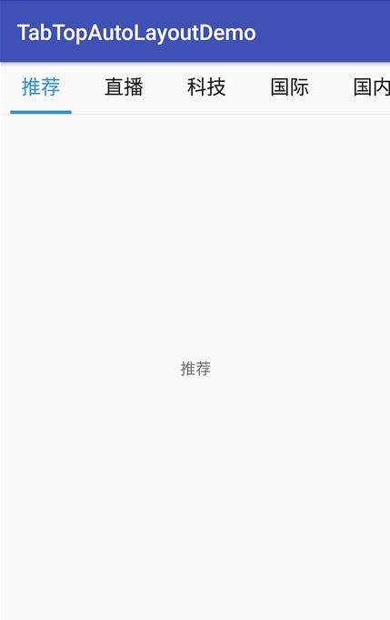
效果圖
代碼分析
TabTopAutoLayout:底部選項卡布局類——自定義的LinearLayout子類;實現了各個選項卡的布局、狀態切換、點擊事件的回調。
需要註意:註釋掉params.weight = 1;
//設置要添加的子布局view的參數 LayoutParams params = newLayoutParams(LayoutParams.WRAP_CONTENT, LayoutParams.WRAP_CONTENT); // params.weight = 1;//在tab_item文件的根節點RelativeLayout中是無法添加的,而這個是必須要寫上的,否則只會展現一個view params.gravity = Gravity.CENTER;
下劃線的寬度值需要在代碼中設置
//===========設置選項卡控件的下劃線【不能使用View,否則setWidth不能用】========== finalTextView top_underline = (TextView) toptabitemView.findViewById(R.id.top_underline); //設置下劃線的寬度值==根布局的寬度 top_title.measure(View.MeasureSpec.UNSPECIFIED, View.MeasureSpec.UNSPECIFIED); Log.w("why", "top_title.getMeasuredWidth()="+top_title.getMeasuredWidth()); toptabLayout.measure(View.MeasureSpec.UNSPECIFIED, View.MeasureSpec.UNSPECIFIED); Log.w("why", "toptabLayout.getMeasuredWidth()="+toptabLayout.getMeasuredWidth()); top_underline.setWidth(toptabLayout.getMeasuredWidth());//手動設置下劃線的寬度值
可滑動效果是在activity_main布局文件中實現的
    <!-- 可滑動的頂部選項卡區域 -->
    <HorizontalScrollView
        android:layout_width="match_parent"
        android:layout_height="wrap_content"
        android:scrollbars="none">

        <com.why.project.tabtopautolayoutdemo.views.tab.TabTopAutoLayout
            android:id="@+id/id_titleLayout"
            android:layout_width="wrap_content"
            android:layout_height="match_parent"
            android:gravity="center_vertical"
            android:orientation="horizontal"
            />
    </HorizontalScrollView>
使用步驟
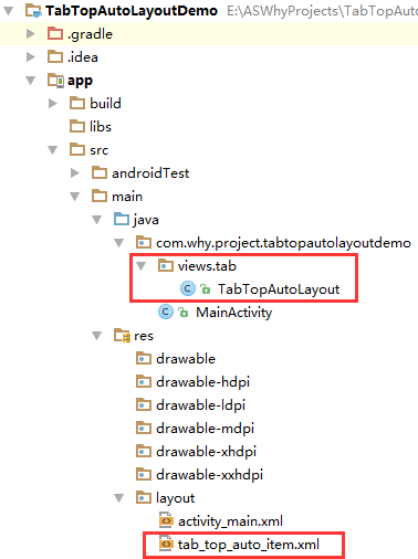
一、項目組織結構圖
註意事項:
1、 導入類文件後需要change包名以及重新import R文件路徑
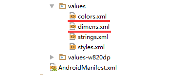
2、 Values目錄下的文件(strings.xml、dimens.xml、colors.xml等),如果項目中存在,則復制裏面的內容,不要整個覆蓋
二、導入步驟
將TabTopAutoLayout.java文件復制到項目中

package com.why.project.tabtopautolayoutdemo.views.tab;

import android.content.Context;
import android.util.AttributeSet;
import android.util.Log;
import android.view.Gravity;
import android.view.LayoutInflater;
import android.view.View;
import android.widget.LinearLayout;
import android.widget.RelativeLayout;
import android.widget.TextView;

import com.why.project.tabtopautolayoutdemo.R;

import java.util.ArrayList;
import java.util.Arrays;
import java.util.List;

/**
 * Created by HaiyuKing
 * Used 頂部動態選項卡數據且可滑動
 */

public class TabTopAutoLayout extends LinearLayout {

    private Context mContext;
    //選項卡標題
    //CharSequence與String都能用於定義字符串,但CharSequence的值是可讀可寫序列,而String的值是只讀序列。
    private CharSequence[] toptab_Titles = {""};

    //選項卡的各個選項的view的集合:用於更改背景顏色
    private List<View> toptab_Items = new ArrayList<View>();
    //選項卡的各個選項的標題的集合:用於切換時改變文字顏色
    private List<TextView> topTab_titles = new ArrayList<TextView>();
    //選項卡的各個選項的下劃線的集合:用於切換時改變下劃線顏色
    private List<View> topTab_underlines = new ArrayList<View>();

    public TabTopAutoLayout(Context context, AttributeSet attrs) {
        super(context, attrs);

        mContext = context;

        List<CharSequence> toptab_titleList = new ArrayList<CharSequence>();
        toptab_titleList = Arrays.asList(toptab_Titles);
        //初始化view:創建多個view對象(引用tab_bottom_item文件),設置圖片和文字,然後添加到這個自定義類的布局中
        initAddBottomTabItemView(toptab_titleList);
    }

    //初始化控件
    private void initAddBottomTabItemView(List<CharSequence> tabTitleList){

        int countChild = this.getChildCount();
        if(countChild > 0){
            this.removeAllViewsInLayout();//清空控件
            //將各個選項的view添加到集合中
            toptab_Items.clear();
            //將各個選項卡的各個選項的標題添加到集合中
            topTab_titles.clear();
            //將各個選項卡的各個選項的下劃線添加到集合中
            topTab_underlines.clear();
        }

        //設置要添加的子布局view的參數
        LayoutParams params = new LayoutParams(LayoutParams.WRAP_CONTENT, LayoutParams.WRAP_CONTENT);
//        params.weight = 1;//在tab_item文件的根節點RelativeLayout中是無法添加的,而這個是必須要寫上的,否則只會展現一個view
        params.gravity = Gravity.CENTER;

        for(int index=0;index<tabTitleList.size();index++){

            final int finalIndex = index;

            //============引用選項卡的各個選項的布局文件=================
            View toptabitemView = LayoutInflater.from(mContext).inflate(R.layout.tab_top_auto_item, this, false);

            //===========選項卡的根布局==========
            RelativeLayout toptabLayout = (RelativeLayout) toptabitemView.findViewById(R.id.toptabLayout);

            //===========設置選項卡的文字==========
            final TextView top_title = (TextView) toptabitemView.findViewById(R.id.top_title);
            //設置選項卡的文字
            top_title.setText(tabTitleList.get(index));
            //===========設置選項卡控件的Tag(索引)==========用於後續的切換更改圖片和文字
            top_title.setTag("tag"+index);

            //===========設置選項卡控件的下劃線【不能使用View,否則setWidth不能用】==========
            final TextView top_underline = (TextView) toptabitemView.findViewById(R.id.top_underline);
            //設置下劃線的寬度值==根布局的寬度
            top_title.measure(View.MeasureSpec.UNSPECIFIED, View.MeasureSpec.UNSPECIFIED);
            Log.w("why", "top_title.getMeasuredWidth()="+top_title.getMeasuredWidth());
            toptabLayout.measure(View.MeasureSpec.UNSPECIFIED, View.MeasureSpec.UNSPECIFIED);
            Log.w("why", "toptabLayout.getMeasuredWidth()="+toptabLayout.getMeasuredWidth());
            top_underline.setWidth(toptabLayout.getMeasuredWidth());//手動設置下劃線的寬度值

            //添加選項卡各個選項的觸發事件監聽
            toptabitemView.setOnClickListener(new OnClickListener() {
                public void onClick(View v) {
                    //設置當前選項卡狀態為選中狀態
                    //修改View的背景顏色
                    setTabsDisplay(finalIndex);
                    //添加點擊事件
                    if(topTabSelectedListener != null){
                        //執行activity主類中的onBottomTabSelected方法
                        topTabSelectedListener.onTopTabSelected(finalIndex);
                    }
                }
            });

            //把這個view添加到自定義的布局裏面
            this.addView(toptabitemView,params);

            //將各個選項的view添加到集合中
            toptab_Items.add(toptabitemView);
            //將各個選項卡的各個選項的標題添加到集合中
            topTab_titles.add(top_title);
            //將各個選項卡的各個選項的下劃線添加到集合中
            topTab_underlines.add(top_underline);

        }

    }

    /**
     * 設置底部導航中圖片顯示狀態和字體顏色
     */
    public void setTabsDisplay(int checkedIndex) {

        int size = topTab_titles.size();

        for(int i=0;i<size;i++){
            TextView topTabTitle = topTab_titles.get(i);
            View top_underline = topTab_underlines.get(i);
            //設置選項卡狀態為選中狀態
            if(topTabTitle.getTag().equals("tag"+checkedIndex)){
                //修改文字顏色
                topTabTitle.setTextColor(getResources().getColor(R.color.tab_text_selected_top));
                //修改下劃線的顏色
                top_underline.setBackgroundColor(getResources().getColor(R.color.tab_auto_selected_top));
            }else{
                //修改文字顏色
                topTabTitle.setTextColor(getResources().getColor(R.color.tab_text_normal_top));
                //修改下劃線的顏色
                top_underline.setBackgroundColor(getResources().getColor(R.color.tab_auto_normal_top));
            }
        }
    }

    /**設置顯示的選項卡集合*/
    public void setTabList(ArrayList<CharSequence> toptab_titleList){
        initAddBottomTabItemView(toptab_titleList);
    }

    private OnTopTabUnderLineSelectListener topTabSelectedListener;

    //自定義一個內部接口,用於監聽選項卡選中的事件,用於獲取選中的選項卡的下標值
    public interface OnTopTabUnderLineSelectListener{
        void onTopTabSelected(int index);
    }

    public void setOnTopTabSelectedListener(OnTopTabUnderLineSelectListener topTabSelectedListener){
        this.topTabSelectedListener = topTabSelectedListener;
    }
}
TabTopAutoLayout
將tab_top_auto_item.xml文件復制到項目中
<?xml version="1.0" encoding="utf-8"?>
<!-- 帶有下劃線的頂部選項卡子項的布局文件(選擇圖片界面) -->
<RelativeLayout xmlns:android="http://schemas.android.com/apk/res/android"
    android:id="@+id/toptabLayout"
    android:layout_width="wrap_content"
    android:layout_height="wrap_content"
    android:gravity="center"
    android:paddingTop="@dimen/tab_top_auto_padding"
    android:paddingLeft="@dimen/tab_top_auto_padding"
    android:paddingRight="@dimen/tab_top_auto_padding"
    >
    <!-- 標題 -->
    <TextView
        android:id="@+id/top_title"
        android:layout_width="wrap_content"
        android:layout_height="wrap_content"
        android:gravity="center"
        android:text=""
        android:textSize="@dimen/tab_top_auto_title_size"
        android:textColor="@color/tab_text_normal_top"
        android:layout_alignParentTop="true"
        android:layout_centerHorizontal="true" />
    <!-- 下劃線-->
    <!-- android:background="@color/tab_underline_selected_top" -->
    <TextView
        android:id="@+id/top_underline"
        android:layout_width="match_parent"
        android:layout_height="@dimen/tab_top_auto_height"
        android:background="@color/tab_auto_normal_top"
        android:layout_below="@id/top_title"
        android:layout_centerHorizontal="true"
        android:layout_marginTop="@dimen/tab_top_auto_padding"
        />

</RelativeLayout>
tab_top_auto_item
在colors.xml文件中添加以下代碼:【後續可根據實際情況更改背景顏色、文字顏色值】
<?xml version="1.0" encoding="utf-8"?>
<resources>
    <color name="colorPrimary">#3F51B5</color>
    <color name="colorPrimaryDark">#303F9F</color>
    <color name="colorAccent">#FF4081</color>

    <!-- *********************************頂部選項卡區域********************************* -->
    <!-- 頂部選項卡下劃線背景色 -->
    <color name="tab_auto_normal_top">#00ffffff</color>
    <color name="tab_auto_selected_top">#3090d9</color>
    <!-- 頂部選項卡文本顏色 -->
    <color name="tab_text_normal_top">#191919</color>
    <color name="tab_text_selected_top">#3090d9</color>

</resources>
在dimens.xml文件中添加以下代碼:【後續可根據實際情況更改底部選項卡區域的高度值、文字大小值】
<resources>
    <!-- Default screen margins, per the Android Design guidelines. -->
    <dimen name="activity_horizontal_margin">16dp</dimen>
    <dimen name="activity_vertical_margin">16dp</dimen>

    <!-- *********************************頂部選項卡區域********************************* -->
    <!-- 選項卡的內邊距 -->
    <dimen name="tab_top_auto_padding">10dp</dimen>
    <!-- 選項卡標題的文字大小 -->
    <dimen name="tab_top_auto_title_size">18sp</dimen>
    <!-- 選項卡標題的下劃線高度 -->
    <dimen name="tab_top_auto_height">3dp</dimen>
</resources>
至此,TabTopAutoLayout類集成到項目中了。
三、使用方法
在Activity布局文件中引用TabTopAutoLayout布局類【註意:需要重新引用TabTopAutoLayout類的完整路徑】
<?xml version="1.0" encoding="utf-8"?>
<LinearLayout
    xmlns:android="http://schemas.android.com/apk/res/android"
    xmlns:tools="http://schemas.android.com/tools"
    android:id="@+id/activity_main"
    android:layout_width="match_parent"
    android:layout_height="match_parent"
    android:orientation="vertical"
    tools:context="com.why.project.tabtopautolayoutdemo.MainActivity">

    <!-- 可滑動的頂部選項卡區域 -->
    <HorizontalScrollView
        android:layout_width="match_parent"
        android:layout_height="wrap_content"
        android:scrollbars="none">

        <com.why.project.tabtopautolayoutdemo.views.tab.TabTopAutoLayout
            android:id="@+id/id_titleLayout"
            android:layout_width="wrap_content"
            android:layout_height="match_parent"
            android:gravity="center_vertical"
            android:orientation="horizontal"
            />
    </HorizontalScrollView>

    <View
        android:layout_width="match_parent"
        android:layout_height="1sp"
        android:background="#e9e9e9"
        />

    <!-- 切換區域 -->
    <TextView
        android:id="@+id/tv_show"
        android:layout_width="match_parent"
        android:layout_height="match_parent"
        android:gravity="center"
        android:text=""/>

</LinearLayout>
在Activity中使用如下
package com.why.project.tabtopautolayoutdemo;

import android.os.Bundle;
import android.support.v7.app.AppCompatActivity;
import android.util.Log;
import android.widget.TextView;

import com.why.project.tabtopautolayoutdemo.views.tab.TabTopAutoLayout;

import java.util.ArrayList;

public class MainActivity extends AppCompatActivity {

    private static final String TAG = "MainActivity";

    private TabTopAutoLayout id_titleLayout;

    private ArrayList<CharSequence> tabTitleList = new ArrayList<CharSequence>();

    /**保存的選項卡的下標值*/
    private int savdCheckedIndex = 0;
    /**當前的選項卡的下標值*/
    private int mCurrentIndex = -1;

    private TextView tv_show;//顯示選中的選項卡的文本

    @Override
    protected void onCreate(Bundle savedInstanceState) {
        super.onCreate(savedInstanceState);
        setContentView(R.layout.activity_main);

        //初始化控件
        initView();
        //初始化數據
        initData();
        //初始化控件的點擊事件
        initEvent();
    }

    @Override
    protected void onResume() {
        // TODO Auto-generated method stub
        super.onResume();
        Log.w(TAG, "{onResume}");
        //設置保存的或者初始的選項卡標紅顯示
        SwitchTab(savdCheckedIndex);

        mCurrentIndex = -1;//解決按home鍵後長時間不用,再次打開顯示空白的問題
        //設置保存的或者初始的選項卡展現對應的fragment
        ShowFragment(savdCheckedIndex);
    }

    /**
     * 初始化控件
     * */
    private void initView(){
        id_titleLayout = (TabTopAutoLayout) findViewById(R.id.id_titleLayout);

        tv_show = (TextView) findViewById(R.id.tv_show);
    }

    /**初始化數據*/
    private void initData() {
        tabTitleList.add("推薦");
        tabTitleList.add("直播");
        tabTitleList.add("科技");
        tabTitleList.add("國際");
        tabTitleList.add("國內");
        tabTitleList.add("體育");
        tabTitleList.add("教育");
        tabTitleList.add("軍事");
        tabTitleList.add("財經");
        tabTitleList.add("社會");
        tabTitleList.add("專題");
        id_titleLayout.setTabList(tabTitleList);
    }

    /**
     * 初始化點擊事件
     * */
    private void initEvent(){
        //每一個選項卡的點擊事件
        id_titleLayout.setOnTopTabSelectedListener(new TabTopAutoLayout.OnTopTabUnderLineSelectListener() {
            @Override
            public void onTopTabSelected(int index) {
                ShowFragment(index);//獨立出來,用於OnResume的時候初始化展現相應的Fragment
            }
        });
    }

    /**控制切換選項卡*/
    public void SwitchTab(int checkedIndex){
        if(id_titleLayout != null){
            id_titleLayout.setTabsDisplay(checkedIndex);
        }
    }

    /**
     * 顯示選項卡對應的Fragment*/
    public void ShowFragment(int checkedIndex) {
        if (mCurrentIndex == checkedIndex) {
            return;
        }
        //隱藏全部碎片
        hideFragments();
        //=============To Do根據實際情況顯示不同的區域=============
        tv_show.setText(tabTitleList.get(checkedIndex).toString());
        savdCheckedIndex = checkedIndex;
        mCurrentIndex = checkedIndex;
    }

    /**隱藏全部碎片
     * 需要註意:不要在OnResume方法中實例化碎片,因為先添加、顯示,才可以隱藏。否則會出現碎片無法顯示的問題*/
    private void hideFragments() {
        //=============根據實際情況進行處理=============
        tv_show.setText("");
    }

    /**
     * http://blog.csdn.net/caesardadi/article/details/20382815
     * */
    // 自己記錄fragment的位置,防止activity被系統回收時,fragment錯亂的問題【按home鍵返回到桌面一段時間,然後在進程裏面重新打開,會發現RadioButton的圖片選中狀態在第二個,但是文字和背景顏色的選中狀態在第一個】
    //onSaveInstanceState()只適合用於保存一些臨時性的狀態,而onPause()適合用於數據的持久化保存。
    protected void onSaveInstanceState(Bundle outState) {
        //http://www.cnblogs.com/chuanstone/p/4672096.html?utm_source=tuicool&utm_medium=referral
        //總是執行這句代碼來調用父類去保存視圖層的狀態”。其實到這裏大家也就明白了,就是因為這句話導致了重影的出現
        //super.onSaveInstanceState(outState);
        outState.putInt("selectedCheckedIndex", savdCheckedIndex);
        outState.putInt("mCurrentIndex", mCurrentIndex);
    }

    @Override
    protected void onRestoreInstanceState(Bundle savedInstanceState) {
        savdCheckedIndex = savedInstanceState.getInt("selectedCheckedIndex");
        mCurrentIndex = savedInstanceState.getInt("mCurrentIndex");
        super.onRestoreInstanceState(savedInstanceState);
    }


}
混淆配置
無
參考資料
暫時空缺
項目demo下載地址
https://github.com/haiyuKing/TabTopAutoLayoutDemo
TabTopAutoLayout【自定義頂部選項卡區域(帶下劃線)(動態選項卡數據且可滑動)】