
手機端的viewport屬性
Window.devicePixelRatio
This read-only property returns the ratio of the resolution in physical pixels to the resolution in CSS pixels for the current display device.
該值為分辨率之間的比,不是直接比較像素。分辨率是指單位英寸內像素數,類似於PPI。
pc端瀏覽器中dpr的值都為1,所以css中1px的元素在屏幕中占據1物理像素。
但在手機端,因為高分屏的出現,物理像素和css邏輯像素並不是1比1的關系。比如iPhone5中的dpr為2,就是2個物理像素對應1個邏輯像素。
另外縮放也會改變這種對應關系。
viewport
The width of the <html> element is restricted by the width of the viewport. The <html> element takes 100% of the width of that viewport.The viewport, in turn, is exactly equal to the browser window: it’s been defined as such.(html的寬度由viewport的寬度決定)
document.documentElement.clientWidth,gives the dimensions of the viewport, and not of the <html> element。 獲取瀏覽器可視窗口的寬度(如果有滾動條時,不含滾動條的寬度)。
screen.width:屏幕的尺寸大小。You’re not interested in the physical size of the screen, but in how many CSS pixels currently fit on it.
Media queries:針對不同尺寸的元素使用不同的樣式。
Web developers are not interested in the device width; it’s the width of the browser window that counts.So use width and forget device-width — on desktop.
手機端
Mobile browser vendors want to offer their
clients the best possible experience, which right now means “as much like
desktop as possible.” That,
however, requires viewport to be split into two: the visual viewport and the
layout viewport. (為了能在移動設備上正常顯示pc瀏覽器上的網站內容,引進了虛擬的layout viewport的概念。)
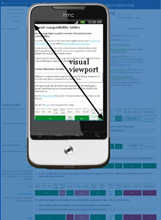
The visual viewport is the
part of the page that’s currently shown on-screen. The user may scroll to change
the part of the page he sees, or zoom to change the size of the visual
viewport.
How wide is the layout viewport? That differs
per browser. Safari iPhone uses 980px, Opera 850px, Android WebKit 800px, and
IE 974px. 所以pc頁面的內容也能在手機上瀏覽,只是會縮的很小。
You can change the orientation of the frame(visual viewport), but the size and
shape of the large image (layout viewport) never changes.
Zooming
Many mobile browsers initially show any page in fully zoomed-out mode. Most browsers zoom out to show the entire layout viewport on the screen. browsers have chosen their dimensions of the layout viewport such that it completely covers the screen in fully zoomed-out mode (and is thus equal to the visual viewport). Thus the width and the height of the layout viewport are equal to whatever can be shown on the screen in the maximally zoomed-out mode. When the user zooms in these dimensions stay the same.
Measuring the visual viewport
visual viewport, it is measured by window.innerWidth/Height,it shows how many CSS pixels currently fit on the screen.
Obviously the measurements change when the user zooms out or in, since more or
fewer CSS pixels fit into the screen.
Event coordinates
pageX/Y is still relative to the page in CSS pixels.
screenX/Y is relative to the screen in device pixels,
this is the same reference that clientX/Y uses, and device pixels are useless.

Meta viewport
<meta
name="viewport" content="width=320">
It is meant to resize the layout viewport. 因為移動端默認的layout viewport比visual viewport大,所以通過meta標簽控制layout viewport的屬性達到更好的顯示效果。
當設置width=device-width時,layout viewport就和visual viewport一樣寬,但是屏幕會縮放到一定比率以顯示所有內容。
縮放(zoom)和移動操作控制的是visual viewport;
layout viewport一旦初始化好後,就不會再變;可以通過meta標簽的屬性控制layout viewport。
蘋果6的顯示效果(通過chrome測試時自動刷新常有問題,最好點擊Toggle device toolbar查看)

蘋果6的dpr為2,物理分辨率為1334*750,所以visual viewport內寬可以顯示375個css像素。
沒有設置meta時,safari默認的layout viewport為980px,若頁面的寬度小於layout viewport的寬度,則顯示980px。否則safari會不斷縮小(zoom out)頁面直到全部layout viewport在visual point中顯示為止。
如果設置width而設定initail-scale的話,會縮放到合適比例,沒有滾動條。

如果再設置initial-scale=1.0,則不會進行縮放,會產生滾動條,通過移動來顯示全部內容:如下

摘自A tale of two viewports,對相關概念介紹的非常清楚。
手機端的viewport屬性